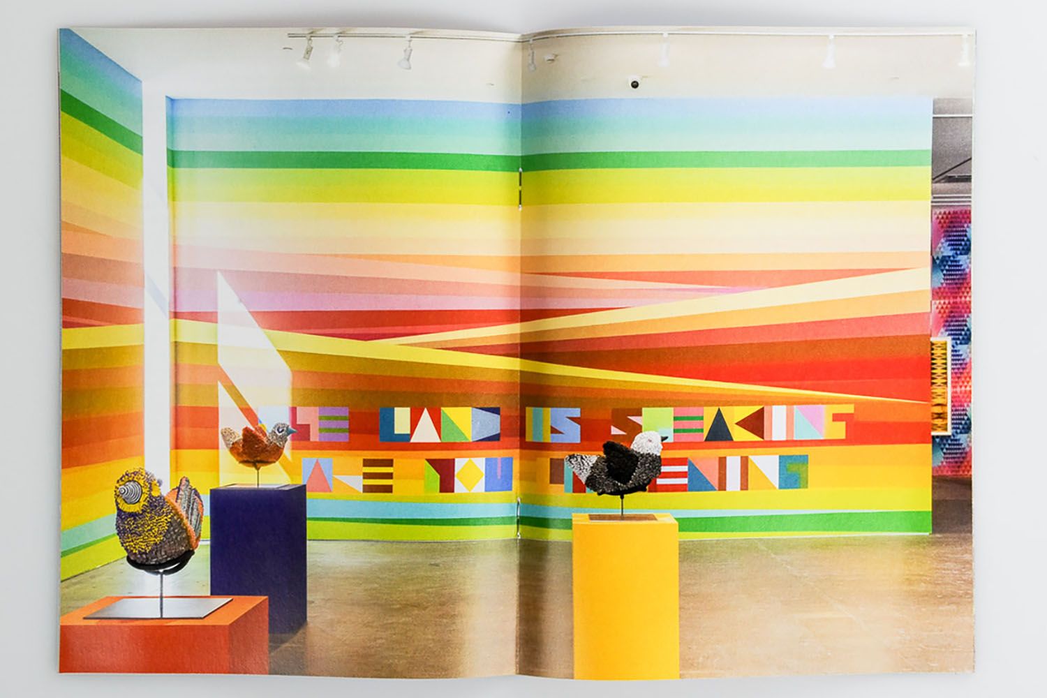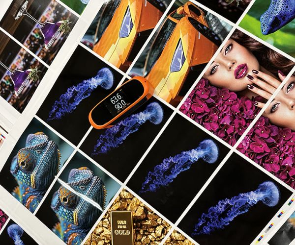
The Science Behind The Spectrum
Color is more than just ink on paper — it’s a communication tool, an emotional spark, and a branding powerhouse. Understanding how color reproduction works unlocks entirely new levels of design potential. By mastering color theory, printing methods, and the role of paper, businesses can elevate even the simplest print into a memorable visual experience. Phillips Printing focuses on delivering high-quality, dependable results with consistency across every job.
- Color Systems Explained: Learn the difference between RGB, CMYK, and six-color systems — and how each impacts print quality.
- Paper’s Role in Color: Explore how brightness, coating, and texture affect color accuracy and intensity.
- Reproducible Gamut: Understand the range of colors printable on press versus what’s visible on screens.
- Gamut vs. Vision: Discover why the most saturated colors the human eye sees are often the hardest to reproduce in print.
Beyond CMYK: New Possibilities
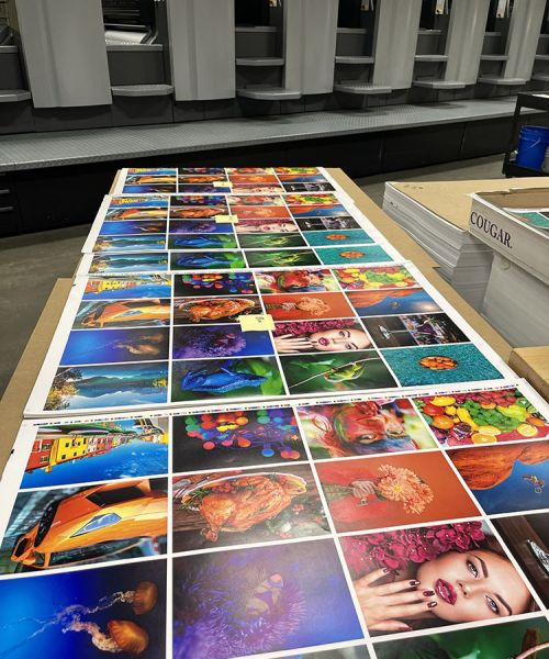
Traditional four-color printing is no longer the ceiling — it’s the floor. With advancements in press technology and ink formulations, printers can now achieve vibrant, nuanced color through custom-ink processes. These enhancements aren’t just technical — they’re strategic opportunities to command attention. Phillips Printing specializes in serving clients with medium to large-volume printing needs.
- Add a Pop with Extra Plates: Using bump or touch plates adds vivid contrast, texture, or emphasis.
- Fluorescent and Metallics: Create standout looks with inks outside the CMYK spectrum.
- Replace to Stand Out: Swap out process colors with specialty inks like PMS Orange or Green.
- More Than Just Visual: Enhance perceived quality and brand identity with unique color decisions.
Tactile Color Techniques
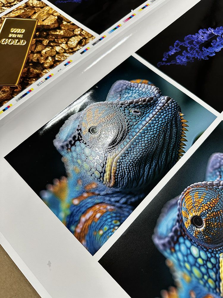
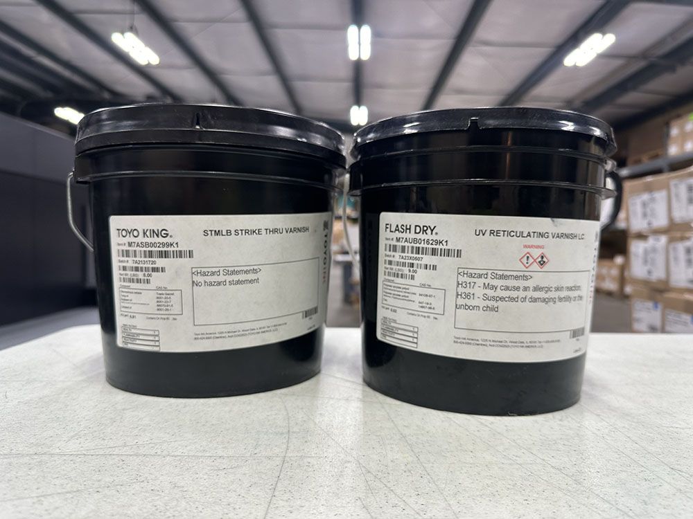
Color enhancement isn’t just about what you see — it’s also about what you feel. Tactile printing techniques, such as using varnishes and coatings, can influence how people perceive the depth and richness of your visuals. These effects create a multi-sensory experience that leaves a lasting impact.
- Varnish with Purpose: Gloss or matte varnishes can highlight or soften specific visual elements.
- Dimensional Effects: Add shadow, sheen, or shine with extra plates for dimensionality.
- UV Coatings and Fluorescents: Push contrast and glow beyond the limits of standard CMYK.
- Showcase with Texture: Give printed materials an upscale, interactive finish.
Choosing The Right Approach
The best way to enhance color depends on your goals, brand, and budget. Whether it’s richer skin tones, more accurate product hues, or packaging with punch, custom enhancements allow for tailored outcomes. From choosing papers to setting press parameters, intentional decisions are key to standing out. Phillips Printing prioritizes clear, consistent communication and hands-on service to support clients effectively.
- Extended Gamut vs. Pantone Spot Color: Compare CMYK printing enhanced with extra inks (like orange, green, and violet) to the precision and consistency of Pantone’s pre-mixed spot colors.
- Color Matching Tools: Learn how PMS and digital tools ensure brand consistency.
- Paper Equals Performance: Select the stock that amplifies your goals — gloss, matte, coated, or uncoated.
- Proofing Like a Pro: Use soft and hard proofs to pre-visualize impact.
How Phillips Printing Can Help

Phillips Printing offers more than ink and paper — we offer strategic insight into how enhancing color can powerfully elevate your marketing materials. Our team collaborates closely with designers and brand managers to determine the best enhancements, paper types, and press settings to meet your objectives.
We specialize in executing complex, medium-to-large print runs with expert precision, and our on-site press checks and sample proofs ensure you’re never in the dark. Because we’re committed to reliability and results, our clients enjoy smooth, low-stress projects with consistent quality throughout. And our hands-on service and deep technical know-how mean you’re supported from concept to completion.
Testimonials
- “The team at Phillips Printing helped us completely revamp our color strategy. The difference was immediate — more pop, more consistency, and better brand recognition.” – Maria
- “We had no idea what was possible until Phillips showed us how six-color printing could transform our catalogs. It was game-changing.” – Jason
- “Hands-on service made all the difference. We felt supported through every step of our high-volume run.” – Stephanie

Case Study
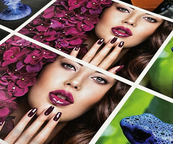
A beauty brand approached Phillips Printing looking to elevate their seasonal product line catalogs. After a consultation, we upgraded them from standard four-color printing to a six-color process with orange and green inks. The result? Enhanced skin tones, vivid product packaging, and increased engagement. Their re-order rate jumped within two quarters.
Did You Know?
Yellow and orange are strongly linked to happiness and cheerfulness. According to a 2025 article in the New York Post, people who felt happier were more likely to choose yellow, while those feeling down gravitated toward gray. This shows how even subtle uses of bright color—especially yellow—can uplift mood, enhance attention, and create a more positive visual experience.
