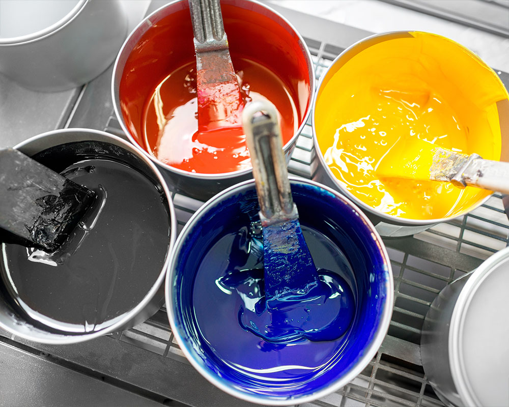
Print production depends on accurate color. Every project aims for clean, consistent results.
Even with strong color management systems, small issues can still happen. Misalignment or slight variations in printing often cause color inconsistencies. These flaws can make a print job look unprofessional.
This is where trapping becomes essential. Trapping is a prepress technique that helps maintain color accuracy and ensures smooth, reliable print results.
In this post, we explain what trapping is, how it works, and why it matters for high-quality printing.
What is Trapping?
Trapping is a prepress process that prevents gaps between adjacent colors during printing. It adjusts how colors meet so small misalignments don’t create visible issues.
During printing—especially with offset methods—paper and ink can shift slightly. These small movements can cause color edges to misalign. As a result, you may see white gaps or uneven color transitions.
Trapping solves this problem by slightly overlapping colors. This overlap creates a buffer zone where colors meet. Even if minor misregistration occurs, the final result still looks clean and seamless.
Why is Trapping Important for Color Accuracy?
1. Compensates for Misregistration
Trapping reduces the visual impact of misregistration. It adds a slight overlap between colors so they remain aligned to the eye.
For example, if yellow and cyan shift slightly during printing, trapping keeps the transition smooth and consistent.
Poor registration can cause color fringing, which creates unwanted halos or shadows.
2. Maintains Color Integrity
Trapping prevents this by blending adjacent colors more effectively. This keeps the design sharp and true to the original.
3. Reduces the Impact of Paper Movement
Paper movement is common in traditional printing. Even small shifts can affect alignment.
Trapping accounts for this by building in a margin of error. This is especially useful in large print runs where consistency matters.
4. Improves Overall Print Quality
Trapping helps every print look polished and professional.
Even when minor shifts occur, the final piece remains clean and visually appealing. This is critical for designs with tight color alignment or fine details.
When designing print materials, ensuring the correct setup of bleeds and safe zones is crucial to achieving a professional, polished look. These elements help prevent important design elements from being cut off during the trimming process and ensure that your print pieces are visually appealing and error-free. In this blog post, we’ll explore what bleeds and safe zones are, why they’re important, and how to manage them effectively for optimal print results.
What Are Bleeds and Safe Zones?
Before diving into the specifics, let’s break down the definitions of bleeds and safe zones:
Bleeds:
A bleed refers to the area of a print document that extends beyond the trim edge. This extra area ensures that there’s no white border around the edge of your design once the document is trimmed to its final size. Bleeds are particularly important when the design includes backgrounds, images, or colors that reach the edge of the page.
Safe Zones:
A safe zone is the area within your design where all essential text and graphics should be placed. This zone is set well inside the trim line and ensures that no crucial elements of your design are cut off during the trimming process. Safe zones account for slight variations in trimming that can occur during the printing and finishing stages.
Why Are Bleeds and Safe Zones Important?
1. Prevent Cutting Errors
Print trimming is not always 100% precise, and slight shifts can occur. If your design does not account for these variations, you risk having critical elements of your design cropped or misaligned. By including bleeds and establishing safe zones, you ensure that your print piece looks clean and professional, even if there’s slight movement during trimming.
2. Professional Appearance
Print materials that have properly managed bleeds and safe zones look more polished and refined. A design that extends all the way to the edge of the page without leaving unintentional borders conveys a high level of attention to detail and professionalism. When you’re printing marketing materials, brochures, or business cards, the last thing you want is an awkward white border around your visuals.
3. Consistency Across Print Projects
Ensuring that your designs adhere to bleed and safe zone guidelines guarantees consistency across different print projects. Whether you’re printing business cards, brochures, or banners, understanding and managing these aspects will make your work appear cohesive and unified, reinforcing your brand’s professional image.
How to Set Up Bleeds and Safe Zones
1. Determine the Bleed Size
Standard bleed sizes typically range from 0.125 to 0.25 inches (3mm to 6mm) on all sides of the document. The exact bleed size will depend on the printer’s specifications, so it’s important to confirm this with your printer before setting up the file. Most printers recommend at least 0.125 inches of bleed to ensure proper trimming.
2. Set the Safe Zone
The safe zone is typically set about 0.25 inches (6mm) inside the trim line. This ensures that important text and graphics are not at risk of being cut off. For more intricate designs, you may want to keep text and logos even further from the edge, just to be safe.
When working in design software like Adobe InDesign, Illustrator, or Photoshop, you can create guides that define both the bleed area and the safe zone, making it easier to see where to place important content.
3. Designing with Bleeds in Mind
If your design includes images or background colors that should extend to the edge of the printed piece, be sure to extend those elements into the bleed area. This ensures that the background or image fully covers the edge of the document after trimming.
For example, if you’re designing a brochure with a color background, make sure that the color extends beyond the trim line, into the bleed area. This way, even if there’s a slight trim shift, your design will still look flawless.
4. Avoid Placing Important Content Too Close to the Trim Line
When positioning text, logos, or other important elements in your design, make sure they’re well within the safe zone. The safe zone provides a margin of error, allowing for slight variations in the cutting process. By keeping all critical elements within this zone, you reduce the risk of anything being cut off or misaligned.
Common Mistakes to Avoid
1. Ignoring the Bleed Area
One of the most common mistakes is not extending backgrounds or images into the bleed area. This often results in unintended white borders around your printed piece, which can detract from the overall aesthetic and professionalism of the design.
2. Placing Important Elements Too Close to the Trim Line
Another frequent error is placing essential text or graphics too close to the trim line. Even though printers try to cut precisely, small shifts can happen. If text or logos are too close to the trim edge, they may be unintentionally cut off or placed inconsistently.
3. Not Double-Checking Printer Specifications
Each printer may have different requirements for bleed sizes, safe zones, and trim lines. Always check with your printer for their specific guidelines and be sure to adjust your design accordingly.
Best Practices for Managing Bleeds and Safe Zones
1. Use High-Quality Images
When designing with bleeds, always use high-resolution images (at least 300 dpi) to ensure that they look crisp and clear after trimming. Low-quality images can appear pixelated or blurry, which can diminish the overall look of your print materials.
2. Check Print Previews and Proofs
Before finalizing your design and sending it to the printer, make sure to check the print preview in your design software. Some programs allow you to view how the document will look once the trim and bleed areas are factored in. If possible, always request a physical or digital proof from your printer before going to print to ensure everything looks as expected.
3. Ensure Your Files Are in the Correct Format
When preparing your files for print, save them in the appropriate format, such as PDF/X-1a, which preserves the bleed and safe zone specifications. Ensure that the final file includes the bleed area and that you have properly embedded fonts and images to avoid printing errors.
Conclusion
Understanding how to manage bleeds and safe zones is essential for creating high-quality printed materials. By accounting for these elements during the design process, you can ensure that your prints look professional, polished, and error-free. Whether you’re designing brochures, flyers, or business cards, following these best practices will help you produce print materials that reflect your brand’s commitment to quality and attention to detail.
When preparing for a print project, whether it’s a brochure, flyer, or poster, one of the most crucial aspects of prepress work is ensuring the file resolution is correct. While this might seem like a small detail, poor resolution can have a significant impact on the final print quality, leaving you with blurred images, pixelation, and disappointing results. In this blog post, we’ll explore why file resolution is so important in the printing process and how to ensure your files are ready for production.
What Is File Resolution?
File resolution refers to the amount of detail an image holds. It’s usually measured in dots per inch (DPI) or pixels per inch (PPI), with higher numbers indicating more detail. In printing, DPI is the key measurement, as it refers to the number of ink dots the printer will use to replicate the image on paper.
Why File Resolution Matters in Print
When you prepare an image for printing, the resolution directly impacts its sharpness and clarity. A file with a low resolution will result in images that appear pixelated or blurry when printed, which can severely diminish the impact of your marketing materials. On the other hand, a high-resolution image provides crisp, clear visuals, ensuring the print job looks professional and visually appealing.
High-resolution images translate into sharp, detailed prints that look polished and professional. This is especially important for high-end marketing materials like brochures or catalogs, where clarity and precision make a lasting impression on your audience.
2. Prevents Pixelation
Pixelation occurs when an image’s resolution is too low to reproduce clearly on the print medium. When printed, pixels become visible to the naked eye, causing images to appear blocky or blurry. Higher DPI ensures that images maintain their integrity and clarity, even when enlarged.
3. Quality Control
Ensuring correct resolution helps avoid costly mistakes during the print run. Subpar resolution may lead to reprints or wasted materials, increasing production costs and delaying your project timeline. Checking resolution early in the prepress process is a simple way to prevent these issues.
What Is the Ideal File Resolution for Print?
When preparing files for print, it’s essential to use the correct resolution for different types of printed materials. Here are the general guidelines:
Standard print materials (brochures, flyers, posters): 300 DPI is ideal for most print jobs. This resolution will ensure that your images are sharp and detailed without being unnecessarily large in file size.
Large-format prints (banners, posters, signage): For large-scale prints, a lower resolution of 150–200 DPI is often acceptable, as these prints are typically viewed from a greater distance, where fine details are less noticeable.
Web or digital images: If you’re preparing images for web use, 72 DPI is the standard, as digital screens don’t require the same level of resolution as printed materials.
How to Check and Adjust Resolution
Before sending your files to print, it’s crucial to check the resolution to avoid potential issues. Here’s how you can do it:
Open the file in an image editing program (like Adobe Photoshop).
Check the DPI or PPI setting (found in the image size settings).
If the resolution is too low, you can increase it—but be cautious. Increasing resolution artificially doesn’t always add detail and can result in a loss of image quality, so it’s best to start with a high-resolution source file.
If your image has low resolution to begin with, consider obtaining a higher-quality version from your source or using vector graphics (which don’t rely on resolution and can scale infinitely without losing quality).
Common Resolution Mistakes to Avoid
Using low-resolution images: If you use an image with a resolution of 72 DPI (designed for digital use) for printing, the final product will likely look pixelated or blurry.
Not checking resolution: Sometimes files are sent directly from a camera or stock image site without checking resolution. Always verify before printing.
Conclusion
File resolution is a fundamental aspect of the prepress process, and getting it right can significantly improve the quality of your print materials. Whether you’re printing a small flyer or a large banner, ensure that your images have the right resolution for the job to avoid disappointing results. By following best practices and checking your resolution settings, you’ll ensure your prints look sharp, professional, and visually compelling.
Understanding Image Formats, Resolution, and Quality for Successful Printing
In the world of printdesign, images are more than just a visual element—they are the heart and soul of your marketing materials, brochures, business cards, posters, and much more. Whether you’re creating a stunning visual for a campaign or simply working on a flyer, the quality of your images plays a critical role in the success of your print project. But before these images make their way to the press, they go through an essential process known as prepress.
Prepress is a crucial phase that prepares your digital designs for printing, ensuring that the images you’ve selected are optimized and ready for the best possible output. In this blog post, we’ll explore the many faces of images in the prepress world, including the various image formats, how to choose the right resolution, and the importance of image quality for a seamless print production process.
The Importance of Prepress in Image Quality
Before an image reaches the printing press, it must undergo specific steps to ensure it looks as vibrant and professional as intended. Prepress is the process that helps prepare the artwork—images included—by checking for errors and optimizing it for the press. A well-executed prepress process can make the difference between a crisp, clean image and one that’s blurry, pixelated, or color-imbalanced.
Understanding the many faces of images in prepress means understanding the intricacies of how digital files are prepared and what kind of images will deliver the best results when printed.
Image Formats: Choosing the Right One for the Job
When working with images for print, it’s crucial to select the appropriate file format. The file format determines how your image is stored, its quality, and how it behaves when used in design programs. The most common image formats in prepress are JPEG, PNG, TIFF, and EPS, each with its own advantages and considerations.
Here’s a breakdown of the most common formats:
JPEG (Joint Photographic Experts Group):
Best for: Photographs and images with gradients.
Pros: JPEG files are smaller in size, making them ideal for web use or quick sharing.
Cons: JPEG uses lossy compression, meaning some quality is sacrificed for file size. This can lead to blurring or pixelation when used in large-scale printing projects.
PNG (Portable Network Graphics):
Best for: Images with transparent backgrounds or logos.
Pros: PNG supports lossless compression, so image quality isn’t compromised. It also handles transparencywell, making it ideal for logos or designs that need to sit on top of colored backgrounds.
Cons: Larger file sizes compared to JPEGs.
TIFF (Tagged Image File Format):
Best for: High-quality images for professional print materials.
Pros: TIFF files use lossless compression, meaning they retain every detail and are often preferred in professional printing. TIFF images are large and detailed, providing excellent quality when enlarged.
Cons: These files can be quite large and may require more storage space.
EPS (Encapsulated PostScript):
Best for: Vector graphics (like logos and illustrations).
Pros: EPS files are scalable without loss of quality, meaning they can be resized to any size without becoming pixelated. This makes them ideal for logos, icons, and vector artwork.
Cons: EPS files can be tricky for beginners and might not be suitable for complex images like photos.
By understanding the characteristics of each format, you can choose the right one based on your specific print project’s needs.
The Role of Resolution in Image Quality
Resolution refers to the detail an image holds and is typically measured in DPI (dots per inch) or PPI (pixels per inch). When it comes to print, resolution is critical because it directly impacts how sharp and clear an image will appear once printed.
In general:
300 DPI is the standard resolution for most print materials. At this resolution, images appear sharp, clean, and detailed, even when enlarged.
72 DPI is standard for web images, but it is too low for print. Low-resolution images (below 300 DPI) often appear blurry or pixelated when printed.
Why 300 DPI is Ideal for Printing
When preparing images for print, 300 DPI ensures that your image will be crisp and clear when reproduced on physical materials like brochures, posters, or catalogs. The higher the DPI, the more pixels the image contains, leading to better detail and sharpness.
When using images for large-format prints like posters or banners, you can often use lower resolutions because the print will be viewed from a greater distance. However, for most print projects—especially those viewed up close, such as business cards or flyers—300 DPI is the gold standard for optimal quality.
The Many Faces of Image Quality
In the prepress world, image quality isn’t just about resolution and format—it’s about ensuring every image is optimized for its intended purpose. Here’s what you need to consider:
Color Accuracy: Colors on your screen often look different when printed due to the variations between digital (RGB) and print (CMYK) color models. In prepress, color conversion from RGB to CMYK is essential to ensure your images print as expected.
Image Cropping and Composition: Sometimes, an image needs to be cropped or adjusted to fit the layout of your project. In prepress, these adjustments must be made carefully, ensuring the final composition looks professional and balanced.
Sharpening and Smoothing: Images sometimes require adjustments for sharpness, especially if they’re being enlarged. Prepress professionals will ensure that images are sharpened without introducing undesirable artifacts, like noise or pixelation.
Image Editing and Retouching: In some cases, images need to be retouched or edited to remove blemishes, adjust lighting, or improve contrast. This step ensures that every visual element is print-ready and looks its best.
Image Compression: Balancing Quality and File Size
When working with images, compression is a key factor to consider. Compression reduces the file size of images for easier storage and faster loading times, but it can also impact quality.
Lossy Compression (used by formats like JPEG) sacrifices some image quality to achieve a smaller file size. While this is fine for web use, it’s not recommended for high-quality prints.
Lossless Compression (used by formats like PNG and TIFF) retains every bit of image data, ensuring that the quality remains intact while reducing file size.
In prepress, the balance between quality and file size is crucial. Large files can slow down the printing process or be difficult to handle, but reducing file size too much can result in a loss of detail. It’s important to optimize images for printing without over-compressing.
Conclusion: Preparing Images for the Press
The prepress stage is vital for turning your digital artwork into print-ready files. By understanding the many faces of images—formats, resolution, color accuracy, and quality—you can ensure that your images are optimized for the highest-quality print production.
When preparing your images, always:
Choose the right file format based on your project.
Ensure images are at the correct 300 DPI resolution for print.
Optimize images for quality without sacrificing file size.
By mastering these essential prepress elements, you can confidently create print materials that showcase your images in their best light. After all, the visuals you choose are the face of your brand, and with the right preparation, they can make a lasting impression on your audience.
In the world of printmarketing, booklets are often overlooked, yet they possess the power to engage and inform in ways that other formats simply cannot. When done right, a booklet serves not only as a marketing tool but as a storytelling medium, capable of sparking curiosity, building trust, and converting prospects into loyal customers. But how exactly can you make the most of this versatile format? Let’s explore the power of booklets, all “by the numbers.”
The Impact of Booklets in Print Marketing
When we think of printmarketing, it’s easy to picture traditional flyers, brochures, and posters. Yet, booklets—compact, portable, and full of content—stand apart as a format that invites deeper interaction. According to the Direct Marketing Association, printed booklets boast an impressive response rate of up to 7%, which is significantly higher than postcards or standard brochures. Why is this?
The booklet format enables businesses to provide more in-depth information, tell a cohesive story, and engage their target audience without overwhelming them. Whether it’s a product catalog, an event program, or a corporate brochure, a booklet is the perfect canvas for delivering a complete narrative with lasting value.
Why Booklets Are Effective in Engaging Audiences
The reason behind the success of booklets can be summarized by one word: engagement. Unlike other print materials, booklets allow for sustained engagement, giving readers the freedom to explore at their own pace. Booklets are not just glanced at—they are held, turned, and revisited, creating an opportunity for more meaningful interaction.
What makes this format unique? The versatility and ability to present information in an organized, digestible format is a key factor. By providing ample space for visuals, infographics, and informative text, booklets allow businesses to communicate more effectively and build a stronger connection with their audience.
Booklet Design: Where Function Meets Form
Designing a booklet that captures attention requires careful attention to both function and form. As we know, content is king, but design is queen. To maximize the impact of a booklet, you must think about it as an experience rather than just a series of pages.
Start with a clear structure. Break your content into sections that flow logically and ensure the reader can navigate easily. The cover is often the first thing that grabs attention, so make sure it’s visually appealing and communicates the essence of your brand. Inside, use high-quality images and graphics that complement your message. Consider interactive elements, like perforations, fold-outs, or inserts, which can make the experience even more memorable.
Booklet Pages: Numbers That Matter
When it comes to the specifics, there are key statistics to consider in booklet design and printing:
The Optimal Page Count: A booklet’s page count can greatly affect its usability and cost-effectiveness. The ideal booklet length is typically between 8 to 48 pages. Longer booklets, while offering more content, can increase production costs and lead to reader fatigue.
Paper Stock: Paper weight and texture play a crucial role in the tactile experience. Standard booklet paper ranges from 60lb to 100lb text weight for inner pages, while covers are typically made from heavier 80lb to 130lb cardstock. The choice of paper can affect the feel of the booklet, contributing to its perceived quality.
Binding Styles: Binding is crucial to both the durability and aesthetic of your booklet. The most common types are saddle-stitching (for booklets with fewer pages) and perfect binding (for more substantial projects). Saddle-stitching tends to be cost-effective and works well for booklets under 40 pages, while perfect binding offers a more polished, professional look for larger booklets.
Trim Size: The most popular trim size for booklets is 5.5″ x 8.5″, which fits nicely in most mailers and is easy to carry. However, depending on your target market and brand, you can choose from a variety of sizes, such as 6″ x 9″or even square formats for a unique touch.
Print Runs and Distribution: The average print run for a booklet falls between 500 and 5,000 copies, depending on the size of the company and its marketing budget. The key is balancing your print run to ensure you meet demand without overproducing.
Booklet Features That Boost Conversion Rates
Booklets not only engage readers—they can drive measurable action. Here’s how to ensure your booklet doesn’t just sit on a shelf:
Strong Call-to-Action (CTA): Whether it’s visiting your website, signing up for a newsletter, or making a purchase, every booklet should include a clear CTA. Placing these CTAs strategically—after presenting valuable information—ensures that your readers are more likely to take the next step.
Personalization: If you’re targeting a specific market or segment, don’t hesitate to personalize the booklet with relevant content or offers. Personalized marketing has been shown to increase engagement by 25%, and that includes in print!
Incorporate QR Codes: QR codes bridge the gap between print and digital, offering readers a way to quickly access additional resources, videos, or special offers. Adding a QR code to a booklet can boost engagement and guide users directly to online resources.
Interactive Elements: Many modern booklets feature interactive components, like scratch-off panels, pop-ups, or fold-outs, that can add an element of surprise and delight. These features keep readers engaged and enhance the likelihood that they’ll take the desired action.
Why Choose Booklets for Your Next Marketing Campaign?
In a world flooded with digital ads, booklets stand out as a tangible, memorable piece of marketing material. Booklets provide an immersive, tactile experience that online formats can’t replicate. They allow you to share your message in a more personal, comprehensive way, and because of their design flexibility, they can adapt to virtually any marketing need.
From promotional booklets to educational resources, this format works because it blends informative content with engaging design—making it a powerful tool for businesses seeking to drive engagement and boost conversions.
Final Thoughts
Booklets are far from obsolete in the age of digital media. In fact, when strategically designed, they hold immense potential to make your brand more memorable and your message more impactful. By paying attention to the details—whether it’s choosing the right page count, using high-quality paper, or incorporating interactive features—you can craft a booklet that not only captures attention but also leads to higher engagement and conversions.
So, next time you’re planning a printmarketing campaign, don’t overlook the power of a well-designed booklet. With the right approach, it can be the game-changer your brand needs.
When it comes to print marketing, sometimes it’s not just about the ink on paper—it’s about the wow factor. Varnishes and UV coatings are powerful techniques that can elevate your printed materials and help your message stand out from the crowd. If you’re looking to create an unforgettable visual experience, consider adding these finishing touches to your next project.
The Power of Print Media
Print has been a trusted form of communication for centuries. Unlike digital content, printed materials engage audiences in a tangible way. People can touch, hold, and even re-read printed pieces at their own pace, which builds trust in the message and the brand.
The physical nature of print allows it to offer a unique, intimate experience that digital media simply can’t replicate. It doesn’t interrupt your busy schedule—it fits seamlessly into it, inviting the reader to engage when they’re ready. This enduring nature of print builds a lasting connection with your audience.
Enhancing Print with Varnishes and UV Coatings
While print media has a long-standing reputation for being a reliable communication tool, adding a varnish or UV coating can take your printed pieces to the next level. These finishing techniques create eye-catching effects that grab attention, adding depth, texture, and sheen to your materials.
Varnishes vs. UV Coatings
Varnishes and UV coatings are both excellent ways to enhance your printed materials, but they differ in their application and effect.
Varnish is applied using the same printing press that prints the image. It can be added during the same print run (inline varnish) or on an already printed sheet (dry-trap varnish). Inline varnishes are efficient but offer a subtler effect because the varnish mixes with wet ink. On the other hand, dry-trap varnish, applied to a fully dried print, results in a stronger effect. For those using UV inks, dry-trap varnish can sometimes be applied in a single press run, creating a sharp, high-impact effect.
UV Coating involves a different process. It’s applied through screen printing and cured with UV lamps. This method allows for a thicker application of coating, creating effects such as high-gloss, matte, textured, glitter, raised, and more. UV coatings can be applied as a flood (covering the entire sheet) or as a spot (applied to select areas). It offers more dramatic contrasts in sheen and texture than varnishes. However, it’s important to note that UV coatings are less precise around edges due to their screen printing method, which may not be ideal for intricate designs.
The Benefits of Varnish and UV Coating Effects
Varnishes and UV coatings allow for endless creativity with varying textures, sheens, and contrasts. Whether you want to add a subtle gloss or create bold, high-contrast designs, these finishing touches can make your print piece truly unique.
Combining different finishes—like gloss and dull—can give your piece a dynamic visual appeal that captivates your audience. And if you’re looking for more texture, raised coatings or glitter finishes can really make your design pop.
How to Apply Varnish and UV Coatings to Your Design
Applying varnishes and UV coatings to your print project is easier than you might think. Often, the printer will handle the setup for these additional layers. All you need to do is specify where you want the effects to be applied, and the prepress team will take care of the rest, creating shapes and assigning the desired finish.
If you’re looking for that extra wow factor for your next print project, consider adding a varnish or UV coating. It can be the perfect way to elevate your design and create a lasting impression that stands out in a crowded marketplace.
As Spinal Tap famously asked, “How much more black could this be? And the answer is none, none more black.” While more isn’t always better, the perfect balance of black in design is crucial. Whether you’re creating digital or print materials, getting the balance of black just right is essential for achieving high-quality, visually appealing designs.
Design for Print vs. Design for Web: Understanding Color Spaces
When designing, the medium you’re working with—whether digital or print—shapes the approach you take. For web design, RGB is typically the preferred color space, while printdesign relies on the CMYK color model. Understanding the difference between RGB and CMYK is crucial for achieving optimal results, especially when working with black in design.
RGB for Web: Flexibility and Color Range
For web design, RGB color offers flexibility and a broad range of colors. RGB (Red, Green, Blue) is based on light (emissive light) and allows for vibrant, saturated colors. However, while designing for the web, it’s important to consider how colors will appear across different devices. To maintain brand consistency, designers must understand how colors convert from RGB to CMYK, especially when planning to use the same designs in both web and print media.
CMYK for Print: Precision and Limitations
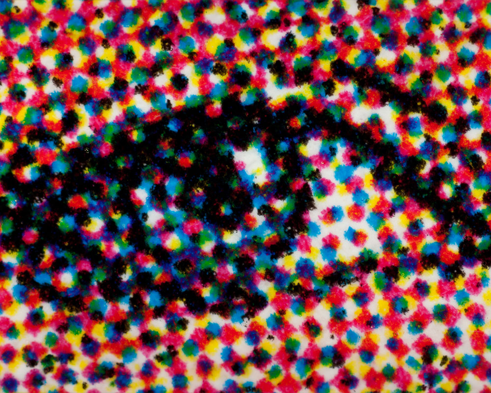
Unlike web design, printdesign uses physical ink and paper, which imposes limitations on the range of colors, particularly black in design. The CMYK model—Cyan, Magenta, Yellow, and Black (K)—is the standard for print. This model mixes ink in varying percentages to produce the full color spectrum. For print, accuracy is key, as issues like ink bleed and setoff can negatively affect the quality of printed materials.
Why Black in Design Matters for Print: Understanding Ink Limits
When working with black in design for print, there are certain considerations to keep in mind. Adding more ink doesn’t necessarily make black appear darker. In fact, print shops often work within an ink limit of about 260% to avoid ink bleed or other printing issues. Adding more ink beyond this limit will not make the black in design deeper, but it can lead to a muddier hue.
For a rich, deep black, the ideal mix is Cyan (C35), Magenta (M25), Yellow (Y25), and Black (K100). This combination, totaling 185% ink, ensures a vibrant, uniform black. While rich black is perfect for large areas, small text should always use 100% black ink to avoid misregistration and blurry print.
The Importance of 100% Black in Small Text
For small text, simplicity is key. Using rich black (a mix of colors) in small text can cause misregistration, leading to a thick, blurry appearance. To prevent this, use 100% black ink for small text to ensure that it remains crisp and clear. Prepress software tools like separations and output preview features in Adobe programs (InDesign, Illustrator, Acrobat) can help identify any problematic text areas before printing.
Prepress Checks and Best Practices for Black in Design
Ensuring that your designs use the correct black ink is essential to avoid prepress issues. Before sending your files to print, always perform separation or output preview checks to verify that black ink is used properly. If you’re unsure, seek assistance from a professional prepress department to confirm that your design is up to standard.
Conclusion: Mastering Black in Design for Consistency and Quality
Black in design plays a pivotal role in both digital and printdesign. Understanding how to use black properly ensures that your designs are clear, consistent, and of high quality. While web design allows more flexibility in color, print requires more precision due to the constraints of ink and paper. By mastering how black is used in your designs, you can ensure your printed materials look their best.
If you have questions about setting up your design files for print, contact Phillips Printing’s prepress department. We’re here to help ensure your designs are optimized before they hit the press!
If you’ve ever heard the term “Pantone®” and thought about complex color theory or expensive swatch books, you’re not alone. Many people are familiar with Pantone but may not fully understand how the Pantone Matching System® (PMS) works. The good news? It’s easier to grasp than you might think. By understanding how Pantone spot colors are created and used, you can simplify the process.
A Brief History of Pantone
Pantone started in the 1950s as a printing company in New York. In the mid-1960s, they began standardizing ink colors and creating reference books. This process led to the creation of the Pantone Matching System, which became a vital tool for designers and manufacturers. The PMS system allows them to reproduce specific colors consistently.
Pantone has become an industry standard, providing swatch books for both process and solid colors. These books detail ink formulations and Lab* target values. Lab* is a color space used to ensure color consistency despite production variances. Although the Pantone system includes references for CMYK colors (process colors), most people refer to its solid colors (spot colors) for precise color matching.
Pantone also produces separate references for coated (C) and uncoated (U) papers. Interestingly, the same ink color will have a different Lab* value depending on whether it’s printed on coated or uncoated paper. A matte reference was briefly available but has since been discontinued—if you have one, guard it!
How Pantone Spot Colors Differ from CMYK
Colors in printing are reproduced using one of two main methods. The first is the CMYK process, which uses four colors: cyan, magenta, yellow, and black. By combining these colors in different amounts, printers can create a wide range of shades. A similar process is used in digital screens (RGB), where colors are created by mixing red, green, and blue light.
The key difference between CMYK and RGB lies in how color is created. RGB relies on an emissive process, meaning more color leads to a brighter (whiter) image. CMYK, on the other hand, uses a reflective process, where adding more color leads to a darker (blacker) result.
Pantone spot colors, however, are produced differently. The Pantone system uses 14 base colors, plus transparent white, to create its spot colors. These include Reflex Blue, Rhodamine Red, Orange 021, and several others. By mixing these base colors, Pantone can achieve hues outside the CMYK color gamut. Some colors, such as certain blues, oranges, and greens, cannot be created with CMYK alone.
Why Don’t We Always Use Spot Colors?
If Pantone spot colors offer such a wider range of hues, why not use them all the time? The answer lies in practical production. Most printing presses are set up for CMYK, which works well for most jobs. CMYK is also essential for printing full-color images. To add a Pantone spot color, however, requires additional steps: producing the ink, creating a new printing plate, and running a separate printing unit. This costs time and money.
Additionally, if a Pantone color is within the CMYK gamut, it’s usually unnecessary to use a spot color. However, there are situations where spot colors make sense. For example, when a brand color is used heavily in a design, using a spot color ensures consistency. Since CMYK uses four independent printing units, consistency depends on maintaining uniformity across each unit. A spot color, being premixed, is less prone to variations, providing a smoother, more solid appearance.
When Should You Use Spot Colors?
There are several scenarios where it makes sense to use Pantone spot colors:
Brand Consistency: If a piece (e.g., a brochure or book) uses a consistent brand color, a spot color ensures that the color remains consistent throughout the print run.
Color Outside CMYK Gamut: When a color cannot be achieved through CMYK (e.g., some bright oranges or specific blues), a spot color is necessary.
Visual Impact: Spot colors often appear smoother and more vibrant than CMYK colors due to their premixed nature.
While spot colors can enhance the design, it’s important to keep production practical. Most jobs only use one or two spot colors in addition to CMYK. Using six spot colors for a design that includes process images would be cost-prohibitive.
Best Practices for Designing with Spot Colors
When designing for print, it’s perfectly acceptable to use spot colors—even if the piece will ultimately be printed in CMYK. Just make sure you convert the spot colors to process in your design software. This ensures your preview accurately reflects the final print output.
For example, in Adobe InDesign®, you can convert spot colors to process by double-clicking the color in the swatches panel and changing the color type to “process.” Alternatively, you can set all spot colors to process globally in the Ink Manager by selecting “All Spots to Process.” Be sure to select the correct Pantone color library (C for coated paper or U for uncoated paper) to ensure your colors are accurately represented.
Pantone also offers “bridge” books that show both spot and their corresponding process colors side by side. These resources are invaluable for printdesigners, helping to set expectations for what will be achievable during production.
Final Thoughts
Spot colors are an essential tool for printdesigners, offering a broader range of colors and more consistency than CMYK process printing. However, it’s important to understand when and why to use them. By considering production costs and design needs, you can make informed decisions about whether to incorporate spot colors into your projects.
If you have questions about spot colors or designing for print, don’t hesitate to reach out. Contact Phillips Prepress at 888-ask-phil for expert advice!
I know what you’re thinking—math! But don’t worry; it’s not as bad as it seems. In reality, math shows up in everyday situations more often than you might realize. From managing your budget to counting your cups of coffee to improving printdesign, math is all around us, and it doesn’t have to be intimidating.
In today’s post, we’ll explore some basic math principles used when folding panels for printed pieces. Understanding how to fold panels requires math because of the physical properties of paper. There are several factors to consider, including the thickness of the paper, the gap between folds, the paper bunching at the crease, and the folding mechanism. While some papers and folds may need unique measurements, a general rule we can apply is 1/16 inch (or 0.0625”). This measurement can be adjusted slightly to 0.06”, 0.065”, or 0.07” if necessary, but we’ll use 0.0625” for consistency with American standard rulers.
Basic Principles of Folding Panels
When folding a sheet of paper into a basic trifold format, there are two types of panels: the outside panels and the inside panel. The outside panels—usually the front and back panels when folded—are the same width. The inside panel, which folds in first, must be slightly shorter to avoid bunching against the opposite fold.
Example: A 9” x 12” Trifold Brochure
Let’s look at a 9” x 12” trifold brochure (see Figure 1). In this case, the outside panels each measure 4”, while the inside panel is 0.0625” shorter to allow the piece to fold neatly. This results in a final flat trim size of 9” x 11.9375”.
Another option is to fold the outside panels to slightly more than 4” to retain the original 9” x 12” trim size (see Figure 2). For instance, the outside panels may fold to 4.023”, and the inside panel to 3.954”. While this solution may seem simpler, it can create issues if the artwork doesn’t consider the fold. In such cases, it’s usually easier to trim the inside panel shorter rather than stretch or adjust the graphics of the outside panel during prepress.
When to Choose Each Folding Solution
Which method you choose depends on the specific needs of your project. For a standard 8.5” x 11” trifold, we typically keep the flat trim size at 8.5” x 11”, resulting in a finished folded size of 3.6875”. We then adjust the artwork to fit the fold. On the other hand, for an 8.5” x 25.5” trifold, we would usually trim the inside panel shorter, allowing the piece to fold down to 8.5” x 11”.
Multi-Panel Folds: Guidelines and Best Practices
For more complex brochures with multiple panels, such as roll folds, double-parallel folds, gate folds, or iron cross folds, the general rule is to make each panel 0.0625” shorter than the next.
A double-parallel fold has two outside panels the same width and two inside panels that are slightly shorter.
A gate fold features two center panels of equal width, with the two outer panels being the same shorter width.
The Importance of Artwork and Prepress Adjustments
Ultimately, the finished size of any folded piece is determined by the artwork and any necessary prepress adjustments. Having adequate bleed and proper panel sizes is crucial for the bindery to make precise folds and produce a high-quality final product.
If you have any questions about designing for print or need help with your folding panel projects, don’t hesitate to reach out to Phillips Prepress. We’re here to assist with any printdesign needs!