
The Role of Trapping in Color Accuracy
Print design often depends on clean edges. A logo, headline, icon, border, or solid color shape may look perfect on screen, but print production introduces small physical variables that digital previews do not show. Paper can move slightly. Plates can shift. Ink can behave differently depending on the stock, press, and design.
When two solid colors meet edge to edge, even a tiny registration shift can create an unwanted white line or visible gap. That is where trapping becomes important.
Trapping is a prepress technique used to create a small overlap between neighboring colors. The goal is not to change the look of the design. The goal is to make sure the printed piece still looks clean if normal press movement causes the colors to land slightly off from each other.
What Is Trapping?
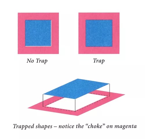
Trapping is the process of slightly adjusting where two printed colors meet so they overlap by a very small amount. This overlap creates a safety margin between adjacent colors.
In a perfect digital file, two shapes may touch exactly. For example, a red circle may sit directly against a blue background. On screen, the edge looks seamless. On press, however, a slight shift between colors could reveal a thin white gap where the paper shows through.
A trap helps prevent that gap. Instead of relying on two colors to meet with absolute precision, prepress can slightly expand or contract one color so the two areas overlap.
This is especially useful in solid color graphics, where sharp edges and flat areas of color make small registration issues easier to see.
Why Solid Color Graphics Need Special Attention
Trapping is often most noticeable in designs that use solid blocks of color, reversed type, simple graphics, icons, borders, or brand marks. These elements tend to have clean edges, which means any misalignment can stand out quickly.
Examples include:
- A light-colored shape placed on a dark background
- A logo made from two or more spot colors
- A solid headline reversed out of a colored panel
- A border that touches another printed color
- Packaging, labels, or presentation pieces with tight color boundaries
In these situations, trapping is less about “improving color” in a general sense and more about protecting the edge where colors meet. The final printed piece should look intentional, clean, and aligned.
Choking and Spreading: Two Common Trapping Methods
Two common ways to create a trap are choking and spreading. Both adjust the edge between two colors, but they do it in opposite ways.
Spreading
Spreading means slightly expanding the lighter color into the darker color. This can help prevent a white gap from appearing if the colors shift during printing.
For example, if a yellow shape sits on a dark blue background, the yellow may be spread very slightly beyond its original edge. The darker color can hide the small overlap better than the white paper would.
Choking
Choking means slightly reducing or pulling back one color so the surrounding color overlaps it. This is often used when the darker color should hold the edge visually.
For example, if dark type or a dark graphic sits against a lighter solid color, the lighter background may be adjusted so the dark element remains visually sharp.
The choice between choking and spreading depends on the colors, the design, the paper, and the production method. The goal is always the same: create enough overlap to hide normal movement without making the trap visible.

Why Trapping Is Not the Same as CMYK Color Registration
It is easy to confuse trapping with general color registration, but they are not quite the same thing.
CMYK registration usually refers to how the four process colors, cyan, magenta, yellow, and black, align with each other to build full-color images. That matters in photographs, gradients, and process-color artwork.
Trapping, in this context, is more focused on how separate solid color areas meet. It is especially important when one printed color sits next to another and a slight shift could expose the paper underneath.
A good way to think about it is this: registration is about keeping printed colors aligned; trapping is about building a small cushion where alignment cannot be perfect every time.
How Trapping Helps Prevent White Gaps
The most common problem trapping solves is a thin white gap between two adjacent colors. These gaps can happen when the colors are designed to meet exactly but the printed result shifts slightly.
Even a very small gap can be distracting, especially on high-contrast designs. A white line between a dark background and a solid graphic can make the piece look less polished.
By overlapping the colors slightly, trapping gives the press a small margin of error. If one color shifts a fraction, the overlap helps keep the paper from showing through.
When Trapping Should Be Handled Carefully
Trapping is helpful, but it should be subtle. Too much trap can create visible dark edges, muddy color transitions, or unwanted outlines. That is why trapping decisions are usually handled during prepress rather than guessed at during design.
Several factors influence the right approach:
- The colors being printed
- Whether the colors are light or dark
- The type of paper or substrate
- The size of the artwork
- The press and production method
- Whether the piece uses spot colors, process colors, or both
- The visibility of the edge in the final design
A trap that works well on one project may not be right for another. A small business card, a large-format sign, and a multi-color label may each require different judgment.
What Designers Should Know Before Sending Files
Designers do not always need to manually apply traps before submitting artwork. In many cases, the print provider will review the file and handle trapping through the prepress workflow.
However, designers can help by building files cleanly. Vector artwork, properly defined colors, correct bleeds, and clear separations make it easier for prepress to evaluate where trapping may be needed.
It also helps to avoid building critical artwork in a way that depends on impossibly perfect alignment. Very fine reversed type, thin borders between strong colors, or small multi-color details can be more vulnerable to registration issues.
If a design includes tight solid color edges, brand colors, metallic inks, spot colors, or specialty production requirements, it is worth discussing those details before the job goes to press.
Trapping Protects the Finished Piece
Trapping is a small adjustment with an important purpose. It helps solid color graphics print cleanly by reducing the chance of visible gaps between adjacent colors.
The best trapping work is usually invisible. The viewer should not notice the overlap, the choke, or the spread. They should simply see a clean printed piece with sharp edges and professional color alignment.
For designers and print buyers, the main takeaway is simple: when solid colors touch, the file may need more than a perfect digital edge. It may need a practical prepress adjustment that accounts for the realities of print production. That is the role of trapping.