
The Power of CMYK and RGB in Color Printing
When it comes to color printing, understanding the differences between CMYK and RGB color models is crucial for achieving the best results. These two color modes serve distinct purposes and are both integral to the design and printing process. Whether you’re designing a brochure, poster, or business card, knowing when and how to use CMYK or RGB can make all the difference in how your final print piece looks.
In this blog post, we’ll explore the differences between these two color models, their applications, and how they affect the printing process. Let’s dive into the power of CMYK and RGB and discover how to make the most of each for stunning print results.
What is CMYK?
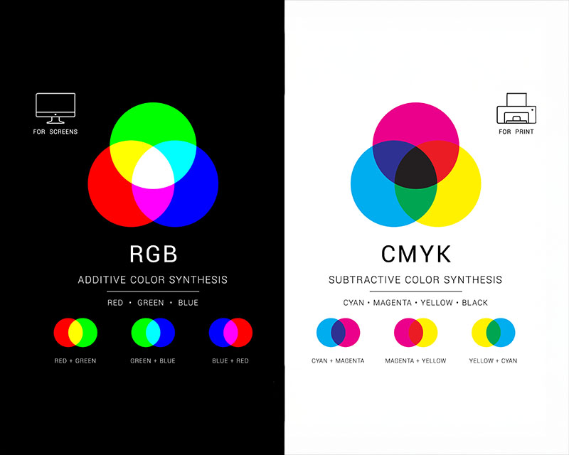
CMYK stands for Cyan, Magenta, Yellow, and Key (Black). It’s a subtractive color model, which means that the colors are created by mixing different percentages of these four colors. This color model is used primarily for print because it’s based on the process of mixing ink on paper.
In the CMYK model:
- Cyan is a blue-green color.
- Magenta is a purplish-red.
- Yellow is a bright yellow.
- Key (Black) is used to deepen the shadows and provide depth in the final image.
What is RGB?
RGB stands for Red, Green, and Blue. Unlike CMYK, RGB is an additive color model used primarily for digital displays like computer monitors, smartphones, and televisions. In this model, colors are created by mixing different intensities of red, green, and blue light.
In the RGB model:
- Red is the primary red light.
- Green is the primary green light.
- Blue is the primary blue light.
The more intense the light, the brighter the color. When all three colors are combined at full intensity, they create white, while a lack of all three colors creates black.
Key Differences Between CMYK and RGB
1. Color Creation Process
- CMYK: Works by subtracting colors from white. As the colors are mixed, they absorb (subtract) light, creating darker, more muted tones. This is ideal for printing, as ink is applied to paper and absorbs light.
- RGB: Works by adding colors together. The more light added, the lighter and brighter the color becomes. This model is designed for screens that emit light, creating vibrant and vivid displays.
2. Usage in Design
- CMYK is the color mode used in print projects, as printers rely on ink to create color. When designing for print, all images and graphics should be set in CMYK to ensure the colors you see on-screen closely match the final printed product.
- RGB is used for digital designs, such as web pages, email templates, and social media graphics. RGB provides brighter, more saturated colors that look great on screens.
3. Color Range
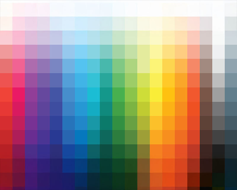
- CMYK has a more limited color range compared to RGB, meaning some vibrant colors you see on screen may not be achievable in print. For instance, some bright greens and blues in the RGB spectrum may appear duller or muted in print.
- RGB can display a wider range of colors, making it ideal for digital media, where brightness and vibrancy are key.
4. Final Output
- CMYK colors tend to appear darker on the final print compared to how they appear on screen. This is due to the subtractive nature of the color model, where some brightness is lost as the inks absorb light.
- RGB colors, on the other hand, appear brighter and more vivid on screen because they are based on emitted light. However, RGB images need to be converted to CMYK for print, as printers can only produce colors from the CMYK spectrum.
Why Does This Matter for Print?
When creating designs for print, using the CMYK color model ensures that what you see on your screen (in RGB mode) can be replicated as closely as possible in the final print. However, since RGB displays more vibrant colors than CMYK can reproduce, it’s essential to adjust your design expectations and plan accordingly.
Color Consistency
If you design your file in RGB but print it in CMYK, you may notice some color shifts. For instance, a bright red in RGB may print as a duller shade of red in CMYK. This is why it’s crucial to switch to CMYK before finalizing your design for print.
Many design programs like Adobe Photoshop and Illustrator allow you to preview your design in both RGB and CMYK modes, helping you visualize how your colors will change from screen to print. To avoid surprises, it’s always a good idea to check your design’s color accuracy in the CMYK mode before sending it to the printer.
Soft Proofing
To further ensure that the colors in your design will print accurately, many printers offer soft proofing services. This involves simulating what your design will look like in print on a monitor. It’s an essential step to check how colors from the RGB spectrum will translate to the CMYK color model.
Tips for Managing CMYK and RGB in Your Design Process
1. Start in the Right Color Mode
If your end product is for print, begin your design in CMYK mode. This will give you an accurate preview of how the colors will look when printed. For digital designs, start in RGB mode to take full advantage of screen vibrancy.
2. Convert RGB to CMYK
If you’ve designed in RGB and need to print your work, be sure to convert it to CMYK before sending it to print. Be aware that some colors in RGB may not be achievable in CMYK, so it’s essential to adjust accordingly.
3. Check Your Monitor Calibration
Monitors display colors in RGB mode, which means the colors you see might not always match the printed output. Ensure your monitor is properly calibrated to help you visualize colors more accurately. If you’re working on color-critical designs, consider using a color calibration tool to adjust your display.
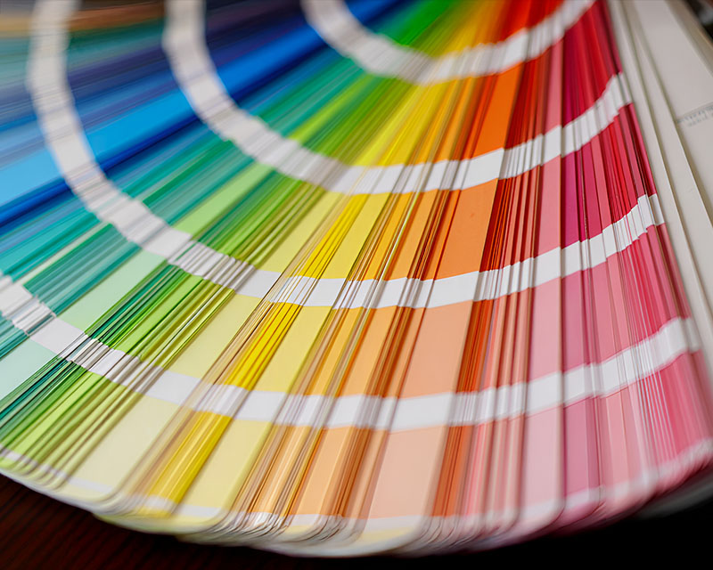
4. Use Pantone Colors for Precision
If you require precise colors for branding purposes, consider using Pantone Matching System (PMS) colors, which can be printed consistently across different devices and media. Pantone colors are standardized colors that ensure accuracy in the CMYK printing process.
Conclusion
In the world of color printing, understanding the differences between CMYK and RGB is vital for achieving the results you want. By designing with the appropriate color mode in mind, you can ensure that your final print materials match your expectations and avoid any color discrepancies. Whether you’re working on a print project or designing for the digital world, mastering the use of these two color models will help you create vibrant, professional designs that truly stand out.