Contact Us
Get Quote
Upload File
888-ask-phil

Exploring the World of Digital vs. Offset Printing

When it comes to printing, two methods stand out: digital printing and offset printing. Both have their strengths and are suitable for different types of projects, but understanding their differences can help you make the best decision for your specific needs. In this blog post, we’ll explore the world of digital vs. offset printing, compare their benefits and drawbacks, and help you decide which method is right for your next print project.

What Is Digital Printing?

Digital printing refers to the process of transferring a digital image directly onto a variety of media, typically through laser or inkjet technology. This method eliminates the need for plates or cylinders, making it ideal for shorter print runs and more customized print jobs.

Key Features of Digital Printing:

  • No Setup Costs: Digital printing does not require the creation of printing plates, which means it’s perfect for small runs or on-demand printing. Whether you need 10 copies or 1,000, digital printing can easily accommodate both.
  • Quick Turnaround: Because it’s a direct-to-media process, digital printing has a faster production time compared to offset printing. This makes it an excellent choice when time is of the essence.
  • Customization: One of the biggest advantages of digital printing is the ability to personalize each piece of printed material. It’s ideal for projects requiring variable data printing, like personalized postcards, invitations, or direct mail.

What Is Offset Printing?

Offset printing, on the other hand, is a more traditional printing method that involves transferring an image from a plate to a rubber blanket and then onto the printing surface. It’s typically used for larger print runs, such as magazines, catalogs, brochures, and books.

Key Features of Offset Printing:

  • High-Quality Results: Offset printing provides exceptionally high-quality images with precise color accuracy, making it ideal for projects requiring fine details and vibrant colors.
  • Cost-Effective for Large Runs: Although offset printing involves setup costs, the per-unit cost decreases significantly as the volume increases. This makes it an excellent option for large print runs (e.g., 5,000 or more copies).
  • Consistent Color Reproduction: Offset printing uses ink and precise registration to ensure consistent color reproduction throughout the entire run, making it ideal for projects where color consistency is critical.

Digital vs. Offset Printing: Key Differences

Now that we’ve covered the basics of both methods, let’s look at some of the key differences between digital and offset printing:

1. Print Volume

  • Digital Printing: Best for small to medium print runs (under 1,000 copies).
  • Offset Printing: Ideal for large print runs (over 1,000 copies), as the per-unit cost decreases with volume.

2. Setup Time and Costs

  • Digital Printing: Minimal setup time and no plate creation, making it cost-effective for smaller runs and quick turnarounds.
  • Offset Printing: Requires setup time for creating plates and preparing the press, which adds to the cost and turnaround time but is more efficient for large print jobs.

3. Color Quality

  • Digital Printing: While modern digital printers offer high-quality results, they may not match the level of color precision achieved with offset printing.
  • Offset Printing: Known for delivering high-quality color reproduction and consistency, particularly with complex and full-color designs.

4. Customization and Personalization

  • Digital Printing: The ability to print custom data, names, or images makes it perfect for personalized marketing materials.
  • Offset Printing: Limited customization, as it generally prints the same image or design on all copies.

5. Print Materials

  • Digital Printing: Can print on a variety of materials, including standard paper, synthetic media, and more.
  • Offset Printing: Offers a wider range of printing materials, including different types of paper, specialty stocks, and finishes.

When to Choose Digital Printing

Digital printing is the way to go if:

  • You need a quick turnaround for small or medium print runs.
  • Your project requires personalization (such as direct mail, customized brochures, or variable data printing).
  • You need low setup costs and want to print on demand.

When to Choose Offset Printing

Offset printing is the better choice when:

  • You have a large print run and want to reduce the per-unit cost.
  • You need consistent, high-quality color and sharp details across many copies.
  • Your project involves special finishes or unique paper types that offset printing can handle more efficiently.

Conclusion

Both digital and offset printing have their place in the world of print. Digital printing is perfect for short runs, fast turnarounds, and customization, while offset printing excels with large quantities, precise color reproduction, and high-quality results. By understanding the strengths and limitations of each method, you can make an informed decision about which is best suited for your next print project.
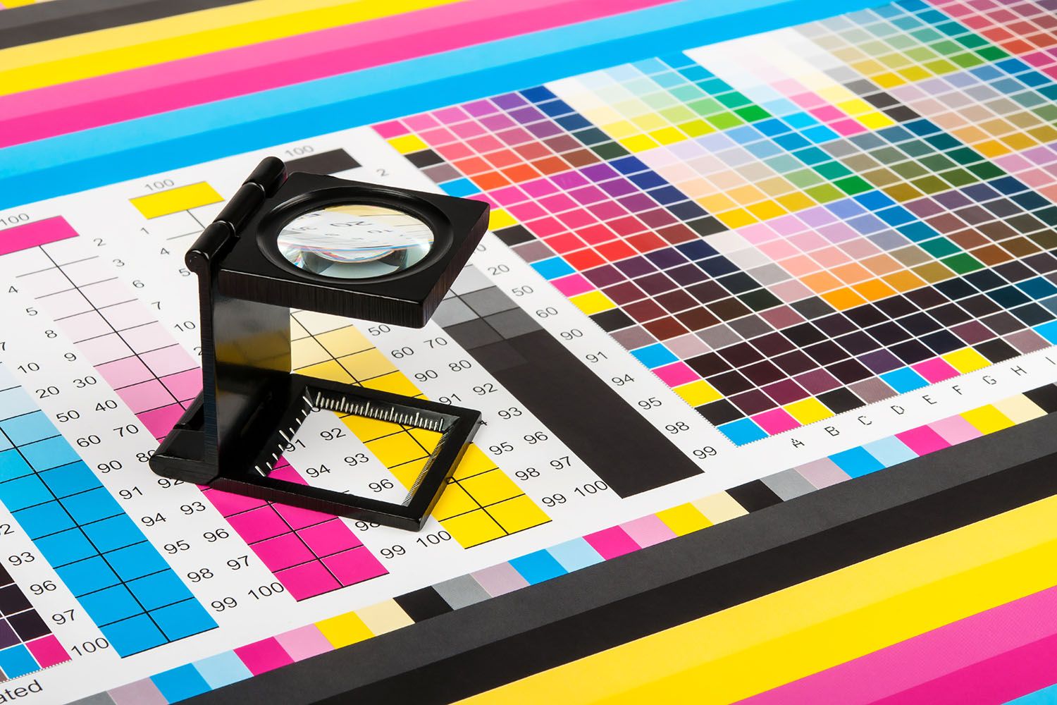
Color Elegance: Unlocking the Power of Color in Print Design

Color is more than just a visual element—it’s a powerful communication tool that can convey emotion, build brand identity, and create lasting impressions. When it comes to print, color elegance is about achieving that perfect balance of vibrancy, sophistication, and consistency. Whether you’re designing brochures, business cards, posters, or packaging, the colors you choose have a direct impact on the effectiveness of your printed materials. The right color choices can elevate your design and make your message stand out in a crowded marketplace.

In this blog post, we’ll explore the world of color in print, offering insights into color theory, the importance of color consistency, and how to achieve color elegance in your next print project.

The Psychology of Color: More Than Just a Visual Choice

Before diving into the technical aspects of color printing, it’s important to understand that color carries psychological weight. The hues you select for your designs can evoke emotions, influence perceptions, and even affect behavior. For instance:

  • Red: Often associated with passion, energy, and urgency, red can capture attention and create excitement.
  • Blue: Symbolizing trust, calmness, and professionalism, blue is commonly used by corporate brands to convey reliability.
  • Green: A color that represents nature, growth, and health, green is frequently used in eco-friendly or wellness-related designs.
  • Yellow: Bright and cheerful, yellow can evoke optimism and happiness but should be used sparingly to avoid overwhelming the viewer.
  • Black: A symbol of sophistication, luxury, and elegance, black is often used in high-end print materials and premium products.

Understanding color psychology helps you choose the right hues that align with your brand’s identity and the message you want to communicate. Whether you aim to invoke excitement or trust, the power of color can help you achieve that goal.

Printing Insights - Color Elegance - Phillips Printing Company

Color Models: RGB vs. CMYK

When working with color in the world of print, it’s essential to understand how colors are created and reproduced. The two primary color models used in printing are RGB and CMYK, and knowing the difference is key to achieving the best results.

  1. RGB (Red, Green, Blue):
    • Used for: Digital displays such as computer screens, smartphones, and websites.
    • How it works: RGB is an additive color model, meaning colors are created by combining different intensities of red, green, and blue light. The more light you add, the closer you get to white.
    • Why it’s different: RGB is designed for light-based media, meaning that colors will often appear brighter and more vibrant on screens than they will in print.
  2. CMYK (Cyan, Magenta, Yellow, Black):
    • Used for: Printing on paper and other physical media.
    • How it works: CMYK is a subtractive color model, meaning colors are created by subtracting light using different levels of ink. When combined, cyan, magenta, and yellow produce a wide range of colors, while black (K) is added to deepen shadows and improve contrast.
    • Why it’s different: Unlike RGB, CMYK colors may appear less vibrant due to the limitations of physical ink, but they are specifically designed for print reproduction.

For high-quality printing, it’s essential to convert your RGB designs to CMYK to ensure color accuracy. This color conversion is especially important when preparing images, graphics, and illustrations for printing. What looks perfect on a digital screen may look slightly different once printed, which is why prepress checks and color profiling are critical steps in maintaining color elegance.

Achieving Color Elegance: Tips for Effective Color Use

Achieving color elegance in print isn’t just about picking the right colors; it’s about using them thoughtfully and harmoniously. Here are some key tips for achieving color elegance in your print designs:

1. Limit Your Color Palette

While it may be tempting to use as many colors as possible, less is often more. A limited color palette creates a more refined, cohesive look that’s easier on the eyes. Stick to three to five primary colors and choose accent colors that complement your main hues. This helps create a more elegant, balanced design without overwhelming your audience.

2. Use Contrast Wisely

Contrast is one of the most effective ways to make certain elements of your design stand out. But contrast isn’t just about using light versus dark shades; it’s about playing with color opposites on the color wheel (complementary colors), such as:

  • Red and green
  • Blue and orange
  • Yellow and purple Contrast can add depth and dimension to your design, but be careful not to overdo it. Too much contrast can make a design feel chaotic or cluttered, which detracts from the elegance you’re trying to achieve.

3. Consider Color Harmony

In color theory, harmony refers to how well colors work together. There are different types of color harmonies you can use in your print design:

  • Analogous Colors: Colors that sit next to each other on the color wheel (e.g., blue, green, and yellow). These create a calm, harmonious feel.
  • Complementary Colors: Colors that are opposite each other on the color wheel (e.g., red and green). These create high contrast but can be vibrant and energetic when used effectively.
  • Triadic Colors: Three colors that are evenly spaced around the color wheel (e.g., red, yellow, and blue). This creates a balanced, vibrant design.

By using color harmonies, you can create a sense of flow in your design that makes it feel more polished and sophisticated.

4. Leverage Color for Brand Recognition

Your brand’s color scheme is a powerful tool for recognition. Brands like Coca-Cola, Apple, and McDonald’s have achieved iconic status in part because of their distinctive color choices. When designing print materials for your brand, ensure that your colors are consistent across all touch points—from your logo to your marketing collateral. This reinforces your identity and helps your audience recognize your brand at a glance.

5. Test Colors Before Going to Print

As we discussed earlier, colors can look different on screens versus on paper. Monitor calibration and color profiling are essential steps in achieving the desired outcome. It’s always a good idea to request a print proof from your printer before committing to a large run. This allows you to see how the colors translate from digital to print and make adjustments if necessary.

Printing Insights - Color Elegance - Phillips Printing Company

The Role of Paper and Finishing in Color Elegance

While color is a critical aspect of design, the type of paper you print on can also affect how colors appear in the final product. Glossy, matte, and uncoated papers all interact with ink differently. Glossy papers, for example, tend to enhance color vibrancy and are often used for high-end marketing materials like brochures and catalogs. On the other hand, matte paper provides a more subdued, elegant finish and is ideal for non-profits organizations, luxury branding and sophisticated designs.

Additionally, finishing techniques like spot UV coatings, embossing, or foil stamping can add depth and texture to your print project, enhancing the overall elegance and appeal.

Final Thoughts: The Power of Color Elegance in Print

In the world of print, color elegance is not about being bold for the sake of it; it’s about creating a design that speaks to the viewer in a way that feels harmonious, refined, and purposeful. The careful selection and use of color can elevate your brand, communicate your message clearly, and ensure that your print materials stand out in a crowded market.

By understanding the psychology of color, selecting the right formats and models for print, and using color harmonies effectively, you can unlock the true potential of color in your print design. Whether you’re creating marketing materials, packaging, or business collateral, color elegance can transform your project from ordinary to extraordinary.

When it comes to printing, remember that color matters—and a well-executed color strategy can make all the difference in delivering a memorable and impactful message.

The Impact of Extended Gamut

In the world of printing, color accuracy is paramount. Whether you’re designing a brand logo, a marketing brochure, or a packaging concept, color is often the first thing your audience notices. Extended Gamut is a game-changer in color reproduction, offering a wider and more precise color range than ever before. If you’re aiming to push the boundaries of print quality, embracing Extended Gamut can be the key to achieving the bold, vibrant hues your designs deserve.

What Is Extended Gamut, and Why Does It Matter?

Traditional printing processes use a limited set of color inks—Cyan, Magenta, Yellow, and Black (CMYK)—to reproduce a wide range of hues. However, there are many colors outside this traditional gamut that can’t be accurately reproduced. This is where Extended Gamut comes in. Extended Gamut printing adds additional colors. Orange, Green, and Violet add to the standard CMYK palette, expanding the color space and allowing for more precise, vivid results.

Think of it like a painter adding more colors to their palette. Having access to more pigments means being able to recreate a wider variety of shades and tones. Extended Gamut unlocks the potential for richer colors, improved gradients, and more detailed imagery in your printed materials.

The Advantages of Extended Gamut in Print

  1. Improved Color Accuracy and Consistency
    With Extended Gamut, printers can achieve colors that are more faithful to the original design. This is particularly useful for brands that require exact color matching. This occurs across multiple print runs or applications. The added colors ensure a higher degree of consistency across different media, whether you’re printing on paper, packaging, or fabric.
  2. Wider Color Range for Richer Designs
    Incorporating additional color channels significantly expands the color spectrum. Designers can now achieve more vibrant oranges, greens, and purples—colors that were previously challenging to reproduce with the standard CMYK process. This broader color palette allows for more nuanced and visually striking designs that capture attention and convey brand identity more effectively.
  3. Better Gradients and Color Transitions
    Extended Gamut printing excels in gradient accuracy, making it ideal for designs that require smooth transitions between colors. With more inks at your disposal, you can produce intricate gradients and color blends that flow seamlessly, giving your printed materials a sophisticated, high-quality look.
  4. Reduction in the Need for Spot Colors
    One of the standout benefits of Extended Gamut is the ability to reduce the need for spot colors. Spot colors (like Pantone) are often used for precise brand color reproduction, but they can add cost and complexity to the printing process. Extended Gamut enables printers to reproduce these colors using the standard ink set, streamlining the production process and reducing costs.
  5. Sustainability Benefits
    Using fewer inks for specific color needs can contribute to sustainability. By reducing the number of spot inks and minimizing waste during the printing process, Extended Gamut helps companies meet their environmental goals. Fewer ink changes also translate into a more efficient and eco-friendly production cycle.

How Extended Gamut Elevates Your Designs

Extended Gamut’s expanded color range isn’t just for precision. It also enhances the overall aesthetic of your designs. With its ability to replicate more colors, Extended Gamut opens up exciting creative possibilities. Imagine a luxury packaging design with deep, rich hues that demand attention. Or a marketing campaign that leverages vibrant shades to engage and excite an audience.

For industries such as cosmetics, fashion, and food packaging, where color accuracy can make or break a product’s appeal, Extended Gamut can create the perfect visual impact. The consistency and vibrancy offered by this technology set a high standard for print quality.

The Impact of Extended Gamut - Printing Insights - Phillips Printing Company

Applying Extended Gamut to Your Print Projects

Integrating Extended Gamut into your print project is relatively straightforward, but it does require the right equipment and expertise. Not all printers are equipped for this process, so working with a printer that offers Extended Gamut capabilities is essential.

Here’s how it works: When preparing your design, you’ll need to ensure that your file is optimized for Extended Gamut printing. This involves specifying the colors you want to use in your design and ensuring that your file is in the correct color space. The prepress team will then adjust your artwork to match the extended gamut, ensuring that all colors are correctly mapped and balanced for the print process.

From there, the printing process utilizes the expanded color set to produce a finished product with enhanced color accuracy and depth. Whether you’re creating brochures, catalogs, or high-end packaging, Extended Gamut will give your designs the clarity and vibrancy they deserve.

Unlocking the Full Potential of Your Brand’s Visual Identity

In an increasingly visual world, your brand’s color identity is more important than ever. With Extended Gamut printing, you can push the boundaries of what’s possible in color reproduction. This technology allows you to create designs that stand out and leave a lasting impression on your audience. From the subtle nuances of gradients to the bold vibrancy of a brand’s signature hues, Extended Gamut ensures your prints remain true to your vision.

Conclusion: Why Embrace Extended Gamut?

If you’re ready to take your print materials to the next level, consider adopting Extended Gamut printing. With its expanded color space and ability to reproduce complex color schemes with unparalleled precision, this technology offers endless possibilities for creating striking, high-quality printed pieces. Whether you’re aiming for consistency across multiple prints, enhancing your brand’s color identity, or simply elevating the overall aesthetic of your designs, Extended Gamut is a powerful tool that can give your prints the wow factor they deserve.

Extended Gamut isn’t just a trend—it’s the future of printing, bringing color accuracy and creativity to new heights.

Experiencing An Eclipse

Some things you just have to experience.

Every once in a while an experience touches our hearts and minds. Something that makes us glad to be alive. Something that makes us treasure our senses; our ability to touch, smell, taste, hear and see. These senses enhance our awareness of who we are and allow us to fully experience all that this wonderful world has to offer.

All across the world, in different industries and environments, there is rarely just one message that speaks to everyone. Rarely one work of art or piece of literature that appeals to all. But, occasionally there are events that surpass the natural division and bring people together. A common experience that everyone can connect with in their own way.

In the competitive world of marketing it is often difficult to appeal to a broad market and especially challenging to connect with them in a memorable way. The media noise and bright abundance of competition can distract your audience and cause them to loose focus. There is one form of media, however, that is simple and truly appeals to the senses – print.

A unique experience. Something to hold, to feel, to read and reflect upon. Imagine a media that has changed the world, which has been a part of human communication for thousands of years. A media that is real, bold, and inspiring, maybe even transcendent.

It’s not just the feel of the paper. It’s not just the words or the graphics or quality of printing. It is everything together…the experience.

The Life of Paper: From Forests to Print Marketing

It’s alive! Or at least, it once was. Love it or hate it, paper plays a crucial role in our world. From paper bags and notepads to packaging, building materials, and everyday items like paper towels and toilet paper, paper is everywhere. While paper often gets a bad rap, the case for using paper is stronger than you might think.

The Environmental Impact of Paper vs. Plastic

The main ingredient in paper is trees, and while we should always be mindful of preserving forests, the environmental benefits of paper are compelling. Consider the lifecycle of a paper bag versus a plastic bag. It takes 10-20 years to grow a tree for paper, but millions of years to create crude oil for plastic. What’s more, paper biodegrades in less than a week, while plastic bags can take centuries to break down. Trees are renewable resources, and with responsible forest management, paper production can be sustainable. On the other hand, once oil is gone, it’s gone—there’s only about 100 years of oil left on Earth.

While there are alternative materials to paper and plastic, for marketing materials, high-quality paper remains one of the most effective and eco-friendly choices for print collateral, including brochures, direct mail, and more.

Sustainable Paper Sourcing: Responsible Forest Management

Thanks to organizations like the Rainforest Alliance and the Forest Stewardship Council (FSC), forests around the world are being managed to protect their health and increase their size. Sustainable forestry practices in the U.S. have resulted in a 30-million-acre increase in forest cover over the last 15 years. Meanwhile, forest cover in South America has decreased by about 150 million acres in the same period. While FSC’s ability to prevent deforestation is improving, challenges remain, especially in developing countries where socioeconomic factors can complicate efforts. That’s why it’s essential to choose a print provider that sources paper responsibly, ensuring ethical harvesting practices and high-quality, eco-friendly materials.

The Fascinating Process of Paper Production

The production of paper is an efficient and fascinating process. First, trees are harvested, debarked, and turned into chips at a pulp mill. The bark is used as fuel to power the mill. These wood chips are then mixed with natural acids and heated in a pressurized vessel called a digester. This cooking process separates the lignin, a substance that binds plant fibers together, from the fiber itself. The resulting pulp is bright white, and the leftover lignin (called black liquor) is used to help fuel the mill.

Next, the pulp is dried, baled, and sent to a paper mill where it’s mixed with water and formed into a web through large cylinders. As the pulp is pressed between cylinders, water is removed, and the paper begins to take shape. Depending on the desired finish, the paper is either coated for a glossy or matte surface or left uncoated for a more textured feel.

Choosing the Right Paper for Your Print Project

When selecting paper for your print materials, there are four key factors to consider:

Paper Color: While white is the most common color, uncoated stocks come in a variety of shades, including natural, crème, and vibrant colors like fluorescent orange. Specialty papers like metallic and pearlescent sheets can

Paper Type: Paper is divided into two categories—coated and uncoated. Coated stocks have a smooth surface that prevents ink from soaking in, resulting in brighter colors and sharper images. Common coated stocks include glosssilksatindull, and matte. Uncoated paper absorbs ink, creating softer colors and making it ideal for reading, writing, and stationery.

Paper Weight: Paper weight refers to the thickness of the paper, often measured in pounds. Common weights range from 60lb text to 100lb cover, with heavier weights providing a more substantial feel.

Paper Finish: Paper finish impacts the texture of the paper. This is especially important when choosing uncoated paper. Finishes include smoothvellumfeltlinen, and even canvas textures.

1001 Ways to Print

A Comprehensive Guide to Printing Methods

When you think about printing, the options seem endless. Whether you’re creating business cardsbrochures, or custom apparel, selecting the right printing method is critical for achieving high-quality results. In this guide, we’ll explore the most popular printing methods and help you choose the one that’s best for your project.

1. Letterpress Printing: A Timeless Classic

Letterpress printing stands as one of the oldest methods still in use today. The process involves inking a raised image or text on a metal or wooden plate and pressing it onto paper. Though it’s less common now, many designers still choose letterpress printing for custom invitationsbusiness cards, and fine art prints due to its unique tactile quality and vintage charm.

2. Digital Printing: Fast, Efficient, and Customizable

If you need quick, high-quality prints, digital printing is your best bet. By directly transferring an image from a digital file, this method is perfect for small runs and customized printsDigital printing allows you to quickly produce materials like brochuresbusiness cards, and postcards. Additionally, it’s an ideal solution for variable data printing, giving each piece a personalized touch.

3. Inkjet Printing: Precision and Flexibility

Inkjet printing uses tiny droplets of ink sprayed directly onto the substrate. This method excels at printing full-color images, making it perfect for proofing and wide-format projects such as banners or billboards. With both home and commercial options available, inkjet printers offer the flexibility needed to handle different print runs while maintaining excellent image quality.

4. Laser Printing: Clean, Crisp, and Fast

Laser printing uses a laser beam to create an image on a metal drum, transferring toner to paper. This method produces sharp, crisp text and images, making it ideal for printing documentsflyers, and personalized prints. With its high speed and precision, laser printing is perfect for small to medium print runs and is widely used in businesses and commercial settings.

5. Dot Matrix Printing: Still Useful in Certain Industries

Though less common today, dot matrix printing is still used in specific industrial applications. This method creates images by striking an ink ribbon against paper, forming patterns of dots. Dot matrix printers are often used for receipt printing and multi-part forms, especially in warehouse and logistics environments, thanks to their durability and low operating costs.

6. Thermal Printing: Efficient and Reliable

Thermal printing relies on heat to transfer an image onto materials like paper or vinyl. This method is particularly effective for printing labelsbarcodes, and shipping labels. Thanks to its minimal maintenance and speedthermal printers are widely used in retail and logistics, offering a reliable and efficient solution for high-volume printing needs.

7. Dye-Sublimation Printing: Vibrant, Long-Lasting Prints

Dye-sublimation printing is ideal for creating vibrant, long-lasting images. The process turns dye into gas and bonds it with polyester-coated materials, resulting in highly durable prints. This method is popular for printing on custom appareltextiles, and photo prints, offering both high-quality and fade-resistant results.

8. Screen Printing: Ideal for Textiles and Large-Scale Projects

Screen printing involves pushing ink through a mesh screen to create a design. It’s a popular choice for printing custom t-shirtslarge-scale signs, and posters. Best suited for larger print runsscreen printing delivers high-quality results, making it the go-to method for fashion brands and advertisers looking to create promotional materials.

Printing 3_Figure 2

9. Offset Lithography: High-Quality Prints for Large Runs

Offset lithography remains one of the most widely used commercial printing methods. This process transfers ink from a metal plate to a rubber blanket and then onto the printing surface. It’s ideal for high-volume projects like booksmagazines, and catalogs. With its efficiency and cost-effectiveness, offset lithography is perfect for delivering high-quality results on large print runs.

10. Flexography: Perfect for Packaging and Labels

Flexography uses a flexible plate to transfer ink to various substrates, including cardboardplastics, and films. It’s most commonly used for packaging and label printing, offering great versatility. Thanks to its ability to print on a variety of materials, flexography is ideal for long production runs, producing consistent, high-quality results every time.

11. Rotogravure Printing: Best for High-Volume, Consistent Printing

Rotogravure printing uses an engraved cylinder to transfer ink directly to the substrate, making it perfect for high-volume projects. This method is highly efficient for printing newspapersmagazines, and catalogs. Despite its high initial setup costs, rotogravure printing delivers consistent, high-quality prints for large-scale runs.

12. UV Printing: Fast, Eco-Friendly, and Versatile

UV printing uses ultraviolet light to cure ink instantly, making it one of the fastest and most eco-friendly printing methods. This technique is commonly used for business cardscustom items, and decorative prints. The fast-dryingnature of UV printing makes it ideal for quick turnaround times, while its eco-friendly benefits ensure a minimal environmental impact.

13. Sheetfed and Web Presses: Understanding the Differences

Sheetfed presses are used for printing on individual sheets, while web presses utilize continuous rolls of paper. Both are often used in offset printing, but each serves different purposes. Web presses are better suited for large-volume runssuch as newspapers and magazines, while sheetfed presses work best for smaller, more precise print jobs, delivering excellent quality on a range of print products.

How to Choose the Best Printing Method for Your Project

Choosing the right printing process for your project involves understanding key factors like sizematerial, and budget. Whether you need high-quality prints for business cards or large-scale prints for banners, knowing your specific needs helps you make the right decision. If you need precise color matching, quick turnarounds, or eco-friendly options, these factors will guide you toward the best printing solution.

Conclusion: Discover the Right Printing Method for Your Needs

There are countless ways to print, each with its own unique benefits. Whether you’re exploring letterpress printing for a vintage look or UV printing for quick, eco-friendly results, understanding the strengths of each method will help you choose the one that suits your project best. If you’re unsure which method to select, consider consulting a professional printing service. They can provide guidance on the best options for your specific needs.

For more information on various printing methods and to get expert advice, visit philprint.com/resources/faq.

Hybrid vs. Stochastic Screening in Lithographic Printing: What You Need to Know

As the saying goes, there’s more than one way to skin a cat—or, in this case, screen one! All joking aside, today’s post delves into the two main types of screening used in lithographic printinghybrid screening and stochastic screening. Each method comes with its own set of benefits and challenges. In this article, I’ll explain both methods and explore their respective pros and cons in offset lithographic printing.

What Is a Screen in Printing?

In the context of printing, a “screen” refers to both a color tint and a resolution setting. For instance, a lighter tint of black creates gray, and the smoothness of that gray can be considered the resolution or “line screen” (measured in lines per inch, or LPI).

To illustrate, think of a screen door: the holes in the mesh allow air to pass through. Now, imagine pressing ink through this mesh onto paper. The size and number of holes determine how much ink gets transferred to the paper. Fewer or smaller holes yield a lighter tint, while more or larger holes allow more ink, resulting in a darker tint.

This principle is similar to how screen printing works, where ink is forced through a mesh screen to create designs on various materials. However, in lithographic printing, a screen is imaged onto a metal plate that transfers ink onto a rubber blanket, which then applies it to paper. This process is known as offset printing.

Two Types of Screen Methods: AM vs. FM

There are two primary types of screening methods used in lithographic printingAmplitude-Modulated (AM) screeningand Frequency-Modulated (FM) screening (also called stochastic screening). Let’s explore both.

AM Screening: Traditional and Controllable

AM screening is the most common method in lithographic printing. This method uses a fixed dot pattern where the size of each dot changes based on the tint. When the tint gets darker, the dot size increases; when the tint gets lighter, the dot size decreases. However, the number of dots in a given area remains constant.

AM screening is widely used because of its controllable nature. Most printing plates and blankets support standard AM screens, making it easier to use. The quality of the print, however, depends heavily on proper calibration and balancing of consumables.

One limitation of AM screening is the rosette pattern (see Figure 5). This pattern occurs because each of the four CMYK colors is printed at different angles to prevent the dots from aligning. Despite this, the rosette pattern can still be visible in the final print, especially when viewed under magnification.

FM Screening: Fine Detail with Stochastic Dots

FM screening, or stochastic screening, uses a fixed, very small dot size. As the tint darkens, more dots are added, and as the tint lightens, fewer dots are used. The key difference here is that the size of the dots remains constant throughout the process.

FM screening excels at reproducing fine, detailed images, such as textures in fabric, leather, or skin tones. It delivers higher resolution and smoother transitions, making it ideal for high-quality reproductions of intricate images.

One of the major advantages of FM screening is that it avoids the moiré effect—a common issue in AM screening. The moiré effect happens when a scanned image interacts with the rosette pattern of AM screening, creating unwanted patterns in the print. Since FM uses a random dot pattern, this problem doesn’t occur.

Additionally, FM screening uses less ink than AM because it has more dots in the same area, resulting in less ink required to achieve the same visual effect.

The Line Screen: Key Differences in Resolution

In AM screeningline screen refers to the number of halftone dots per inch (LPI). This controls the fineness of the dot pattern. The closer together the dots are, the higher the resolution. However, higher resolution can be more challenging to maintain consistently.

Most lithographic printers use a line screen between 133 and 175 LPI, providing a balance between smoothness and consistency.

FM screening doesn’t use a line screen because its dot pattern is random. Instead, the size of the dots is measured in microns, typically between 20 to 30 microns for stochastic printing.

Hybrid Screening: A Blend of AM and FM

Hybrid screening combines elements of both AM and FM screening. It uses AM screening for most of the image but switches to FM screening for tints below 5% and above 95%. This hybrid method creates smoother transitions in the highlights and shadows, improving the overall image quality.

Challenges with FM Screening

Despite its many advantages, FM screening does have challenges. The primary one is that it requires high precision in both equipment and calibration. Not all printing plates can handle the small, random dots of FM screening, and plate erosion (called blinding) can occur if the dot degrades during printing. This results in a lighter or disappearing image.

Additionally, FM screening often requires an additional license and considerable effort to maintain proper calibration. The right balance of consumables is essential to achieving consistent, high-quality results.

Conclusion: Which Screening Method to Choose?

So, if FM screening offers better quality and uses less ink, why don’t more printers use it? The answer lies in the complexity and additional cost of implementation. However, when properly managed, stochastic screening can lead to much higher-quality prints, making it an excellent choice for certain high-end applications.

At Phillips Prepress, we use both hybrid and stochastic screening methods and are proud to be G7 color-space certified in both. If you’d like to see samples or learn more about how these methods work in print, don’t hesitate to reach out to us at 888-ASK-PHIL.

Proof to Print

Ensuring Consistent Color from Proof to Final Print

Setting clear expectations before production begins is essential in custom printing. This process can be challenging. The proofing method used often differs from the printing method used for mass production. Let’s explore how we handle color consistency between proofs and the final printed product.

What Is Proofing in Printing?

Proofing shows how a design will appear once printed. However, the equipment used for proofs differs from high-volume presses. Contract proofers use inkjet printers. Commercial presses use lithographic (offset) or flexographic methods. Some digital presses work for both proofing and production.

Why Proofing and Presses Differ

Inkjet proofers use 6 to 11 colors, while lithographic presses typically use 4 colors (CMYK). These methods cause variations in color, finish, and capability. Paper type also plays a role. Glossy paper yields vibrant colors, while uncoated paper produces lighter, softer tones.

How We Achieve Consistent Color

To ensure color consistency, we fine-tune each part of the process. This includes PDF workflows, CtP calibration, and ink consistency. We also monitor press mechanics and consumables. With a stable process in place, we use dot gain curves and ICC profiles to adjust the color.

Two Ways to Match Proof to Press

There are two main methods for matching a proof to the press output:

  • Method 1: Matching the Press Output – Here, we adjust the proofer to match a specific press. This works well for in-house presses but may not provide the lowest Delta E.
  • Method 2: Using the G7 Standard – This method uses the same G7 target for both the proofer and the press. It ensures color consistency across different equipment. The proofer and press rely on a common reference.

Proofing Stock and White Point

Choosing the right proofing stock is crucial for accurate color simulation. Inkjet proofing stocks come in two types:

  • Coated Stocks – Glossy finishes with vibrant colors.
  • Uncoated Stocks – Matte finishes with softer colors.

The white point of the proofing stock is also vital. This refers to the paper’s ability to reflect light. A paper with a similar white point to the press stock gives a more accurate color simulation.

The Role of Our Advanced Proofing Technology

At Phillips Printing, we use an 11-color inkjet proofer. This closely simulates the color we achieve with our offset presses. Whether we use coated or uncoated stocks, we ensure accurate proofing. Our presses, proofers, and digital printers meet Idealliance color space standards.

Setting Expectations During the Proofing Stage

Proofing helps set expectations early. It also lets us fine-tune graphics before production. This reduces the risk of surprises and ensures the final product matches the client’s vision.

Contact Us for More Information

If you have questions about proof-to-print or color consistency, contact Phillips Printing. Call us at 888-ASK-PHIL. We’ll ensure your printed product meets the highest quality standards.