Contact Us
Get Quote
Upload File
888-ask-phil

Author: Matt Hearn

How to Use Personalization in Direct Mail

When it comes to direct mail marketing, personalization is one of the most powerful tools you can use to engage your audience. Personalizing your direct mail pieces not only makes recipients feel valued but also boosts the likelihood of them taking action. In this blog post, we’ll explore how to effectively use personalization in direct mail, the benefits it offers, and tips for making your campaigns more impactful.

What is Personalization in Direct Mail?

Personalization in direct mail refers to tailoring your printed materials to the individual recipient. This can include addressing the recipient by name, referencing their preferences, or providing content relevant to their specific needs. Personalization helps create a connection with the recipient, which increases engagement and response rates.

Why Personalization Matters in Direct Mail

In today’s world, where consumers are constantly bombarded with generic messages, personalized direct mail stands out. Here’s why personalization is so impactful:

1. Increased Engagement

Personalized mail grabs attention because it feels more relevant to the recipient. When people see their name or a tailored message, they’re more likely to engage with the content. Personalization makes the recipient feel like the message was created just for them, which increases the chances of them taking action.

2. Improved Response Rates

Direct mail campaigns with personalized elements tend to have significantly higher response rates compared to non-personalized mail. According to research, personalized direct mail can increase response rates by up to 50% or more.

3. Enhanced Customer Loyalty

When customers feel personally addressed and valued, they are more likely to remain loyal to your brand. Personalization helps build stronger relationships with customers, encouraging repeat business and increasing the lifetime value of each customer.

Key Ways to Personalize Direct Mail Campaigns

Here are several strategies for integrating personalization into your direct mail campaigns:

1. Use the Recipient’s Name

The simplest and most effective way to personalize direct mail is by using the recipient’s name. Whether it’s on the envelope, letter, or offer, addressing the recipient directly makes the mail piece feel more personal and less like a mass marketing effort.

2. Tailor the Message Based on Customer Data

Incorporating data from your CRM (Customer Relationship Management) system can help you craft targeted messages that resonate with your audience. For instance, you could send personalized offers based on a customer’s previous purchases, interests, or demographic information.

For example:

  • A fitness brand might send a special promotion on workout gear to customers who have bought running shoes before.
  • A skincare company might offer personalized discounts on products suited to a customer’s skin type or concerns.

3. Segment Your Audience

Audience segmentation allows you to group customers by shared characteristics, such as location, behavior, or purchasing history. By segmenting your list, you can send highly relevant and personalized messages to each group.

For instance, if you’re running a sale on winter coats, you could send a different direct mail piece to people in warmer climates versus those in colder regions, highlighting products relevant to their needs.

4. Include Variable Data Printing (VDP)

Variable Data Printing (VDP) allows you to change specific elements of each mail piece based on the recipient’s data. This can include things like the offer presented, images, text, and more. VDP makes it possible to create fully personalized mailers that speak directly to the recipient, enhancing relevance and boosting response rates.

5. Use Personalized Offers

Offering personalized discounts or special deals makes your direct mail more enticing. For example, if a customer has previously bought a product from your store, you could send them a targeted coupon for a similar item or a discount for their next purchase.

6. Interactive Elements

Incorporating interactive elements like QR codes or personalized landing pages is another great way to personalize direct mail. A QR code that links to a personalized offer or web page adds a digital component to your direct mail campaign and can help drive online conversions.

Benefits of Personalization in Direct Mail

1. Higher Engagement and Conversion Rates

As mentioned earlier, personalized direct mail yields higher engagement and conversion rates. When your message resonates with the recipient, they are more likely to take action—whether that’s visiting your website, redeeming a coupon, or making a purchase.

2. Stronger Emotional Connection

Personalization helps create an emotional bond with recipients. When people feel recognized and valued, they’re more likely to form a positive association with your brand, which can lead to greater loyalty.

3. Cost-Effective Marketing

While personalized direct mail requires access to customer data and additional resources for segmentation, it can be incredibly cost-effective in terms of generating higher return on investment (ROI). When recipients are more likely to respond, you’re getting better results for your marketing spend.

Best Practices for Personalized Direct Mail Campaigns

  • Leverage Customer Data Wisely: Ensure that your customer data is up-to-date and accurate. Using outdated or incorrect information can damage the effectiveness of your campaign.
  • Be Relevant: Personalization is only effective if the message is relevant. Avoid sending generic offers or irrelevant products; instead, align your message with the recipient’s preferences.
  • Test and Refine: As with any marketing strategy, testing is key. Try A/B testing personalized mailers with different offers or messaging to see which performs best with your audience.
  • Respect Privacy: Be mindful of privacy concerns when using customer data. Ensure you are transparent about how customer information is being used and always comply with data protection regulations.

Conclusion

Personalization is a powerful tool in direct mail marketing that can significantly improve engagement, conversion rates, and customer loyalty. By tailoring your messages to the individual recipient, you can create a more meaningful connection with your audience and boost the effectiveness of your campaigns. Start incorporating personalization into your next direct mail campaign, and watch as your response rates soar.

Creating a Cohesive Cross-Channel Experience

In today’s marketing landscape, consumers are constantly shifting between different platforms—websites, social media, email, print, and more. This presents a challenge: how can brands create a cohesive cross-channel experience that seamlessly connects all touchpoints and engages their audience effectively?

The key to a successful marketing campaign is integration. When executed properly, a cross-channel campaign can enhance your brand’s visibility, improve customer engagement, and increase conversion rates. In this blog post, we’ll explore how to design a cohesive cross-channel experience that works across multiple platforms, and why consistency is crucial for success.

What is Cross-Channel Marketing?

Cross-channel marketing refers to the practice of using multiple channels—such as email, social media, direct mail, print ads, and websites—to engage with customers and deliver a unified message. Unlike multi-channel marketing, where each channel operates in isolation, cross-channel marketing creates an integrated experience for the consumer, ensuring that each touchpoint builds upon the previous one.

For example, a consumer might first see an ad for your product on social media, receive a follow-up email with a special offer, then get a direct mail piece featuring the same promotion. Each of these interactions is designed to complement one another and guide the customer along their journey toward making a purchase.

Why a Cohesive Cross-Channel Experience Matters

1. Improved Brand Consistency

When customers interact with your brand across multiple channels, they expect the same message, tone, and visuals. A cohesive experience ensures that your brand identity is consistent and easily recognizable, no matter where your audience encounters it. This consistency builds trust and credibility with your audience, which is essential for long-term customer loyalty.

2. Increased Engagement

Consumers are more likely to engage with your brand when they feel like there’s a continuous flow between touchpoints. A cohesive experience creates a sense of familiarity and relevance, which keeps your audience engaged and eager to learn more.

3. Better Data Integration

By aligning your marketing efforts across various channels, you can gather more complete data on your customers’ behaviors. For example, you can track a consumer’s journey across email, social media, and your website, allowing you to gain deeper insights into their preferences and refine your marketing strategies accordingly.

4. Higher Conversion Rates

When your marketing message is consistent and seamless across all channels, customers are more likely to trust your brand and take the next step in their journey—whether that’s signing up for a newsletter, downloading a resource, or making a purchase. A cohesive cross-channel experience helps guide the customer smoothly through the sales funnel.

Steps for Creating a Cohesive Cross-Channel Experience

1. Establish Clear Brand Guidelines

Before you begin creating content for multiple channels, ensure your brand guidelines are well-defined. Your logo, color palette, typography, and overall tone of voice should be consistent across all touchpoints. This consistency reinforces your brand identity and ensures that your messaging remains recognizable no matter where your audience encounters it.

2. Align Messaging Across All Channels

While each platform may have its own unique characteristics, your core message should be consistent. Whether you’re creating a post for social media, an email campaign, or a print ad, the central theme, value proposition, and call-to-action (CTA) should all align. This ensures that customers receive a clear and unified message, regardless of the channel they’re using.

3. Utilize Automation Tools

Automated tools can help streamline your cross-channel marketing efforts. Email marketing automation, social media scheduling, and customer relationship management (CRM) software allow you to maintain a consistent presence across all channels without manually managing each one. This efficiency ensures that your messages reach the right people at the right time.

4. Integrate Online and Offline Channels

Many brands focus on digital channels, but it’s important not to neglect offline touchpoints like direct mail, brochures, or event marketing. These traditional methods can still play a powerful role in a cross-channel strategy. Make sure your offline efforts tie into your online campaigns. For example, a direct mail piece could include a QR code that directs the recipient to a landing page or an online offer, bridging the gap between print and digital.

5. Personalize Your Communication

Personalization is a powerful tool for increasing engagement and conversion in cross-channel campaigns. By using customer data to tailor messages, offers, and content to specific audience segments, you can make your marketing efforts more relevant and impactful. Personalized emails, retargeted ads, and dynamic landing pages can significantly enhance your cross-channel marketing strategy.

6. Track and Optimize Your Campaigns

One of the biggest advantages of a cross-channel approach is the ability to track customer behavior across multiple platforms. Use analytics tools to monitor how customers are interacting with your campaigns. Are they opening your emails? Clicking through your social media posts? Visiting your website? By analyzing this data, you can identify what’s working and make adjustments to improve your results.

Examples of Cross-Channel Campaigns Done Right

Here are some examples of brands that have nailed cross-channel marketing:

  • Coca-Cola: Known for its integrated campaigns, Coca-Cola uses a mix of TV ads, social media, email marketing, and in-store promotions to keep the message consistent and engaging. Whether a consumer is watching a commercial or interacting with the brand on Instagram, the messaging and tone remain unified.
  • Sephora: Sephora’s cross-channel strategy includes personalized email offers, in-app promotions, and social media content that all direct customers to their website or in-store experiences. This cohesive approach makes it easy for customers to transition from one channel to another.
  • Amazon: Amazon’s cross-channel marketing is seamless, with personalized recommendations shown across email, their mobile app, and on their website. Whether you’re browsing on your phone or receiving an email, Amazon’s messaging is clear, relevant, and consistent.

Conclusion

Creating a cohesive cross-channel experience is essential for engaging today’s savvy consumers. By ensuring your messaging is consistent, personalized, and integrated across various platforms, you can enhance customer engagement, improve brand recognition, and ultimately drive better results from your marketing campaigns. Start building your cross-channel strategy today, and watch your marketing efforts become more effective and impactful.

Exploring the World of Digital vs. Offset Printing

When it comes to printing, two methods stand out: digital printing and offset printing. Both have their strengths and are suitable for different types of projects, but understanding their differences can help you make the best decision for your specific needs. In this blog post, we’ll explore the world of digital vs. offset printing, compare their benefits and drawbacks, and help you decide which method is right for your next print project.

What Is Digital Printing?

Digital printing refers to the process of transferring a digital image directly onto a variety of media, typically through laser or inkjet technology. This method eliminates the need for plates or cylinders, making it ideal for shorter print runs and more customized print jobs.

Key Features of Digital Printing:

  • No Setup Costs: Digital printing does not require the creation of printing plates, which means it’s perfect for small runs or on-demand printing. Whether you need 10 copies or 1,000, digital printing can easily accommodate both.
  • Quick Turnaround: Because it’s a direct-to-media process, digital printing has a faster production time compared to offset printing. This makes it an excellent choice when time is of the essence.
  • Customization: One of the biggest advantages of digital printing is the ability to personalize each piece of printed material. It’s ideal for projects requiring variable data printing, like personalized postcards, invitations, or direct mail.

What Is Offset Printing?

Offset printing, on the other hand, is a more traditional printing method that involves transferring an image from a plate to a rubber blanket and then onto the printing surface. It’s typically used for larger print runs, such as magazines, catalogs, brochures, and books.

Key Features of Offset Printing:

  • High-Quality Results: Offset printing provides exceptionally high-quality images with precise color accuracy, making it ideal for projects requiring fine details and vibrant colors.
  • Cost-Effective for Large Runs: Although offset printing involves setup costs, the per-unit cost decreases significantly as the volume increases. This makes it an excellent option for large print runs (e.g., 5,000 or more copies).
  • Consistent Color Reproduction: Offset printing uses ink and precise registration to ensure consistent color reproduction throughout the entire run, making it ideal for projects where color consistency is critical.

Digital vs. Offset Printing: Key Differences

Now that we’ve covered the basics of both methods, let’s look at some of the key differences between digital and offset printing:

1. Print Volume

  • Digital Printing: Best for small to medium print runs (under 1,000 copies).
  • Offset Printing: Ideal for large print runs (over 1,000 copies), as the per-unit cost decreases with volume.

2. Setup Time and Costs

  • Digital Printing: Minimal setup time and no plate creation, making it cost-effective for smaller runs and quick turnarounds.
  • Offset Printing: Requires setup time for creating plates and preparing the press, which adds to the cost and turnaround time but is more efficient for large print jobs.

3. Color Quality

  • Digital Printing: While modern digital printers offer high-quality results, they may not match the level of color precision achieved with offset printing.
  • Offset Printing: Known for delivering high-quality color reproduction and consistency, particularly with complex and full-color designs.

4. Customization and Personalization

  • Digital Printing: The ability to print custom data, names, or images makes it perfect for personalized marketing materials.
  • Offset Printing: Limited customization, as it generally prints the same image or design on all copies.

5. Print Materials

  • Digital Printing: Can print on a variety of materials, including standard paper, synthetic media, and more.
  • Offset Printing: Offers a wider range of printing materials, including different types of paper, specialty stocks, and finishes.

When to Choose Digital Printing

Digital printing is the way to go if:

  • You need a quick turnaround for small or medium print runs.
  • Your project requires personalization (such as direct mail, customized brochures, or variable data printing).
  • You need low setup costs and want to print on demand.

When to Choose Offset Printing

Offset printing is the better choice when:

  • You have a large print run and want to reduce the per-unit cost.
  • You need consistent, high-quality color and sharp details across many copies.
  • Your project involves special finishes or unique paper types that offset printing can handle more efficiently.

Conclusion

Both digital and offset printing have their place in the world of print. Digital printing is perfect for short runs, fast turnarounds, and customization, while offset printing excels with large quantities, precise color reproduction, and high-quality results. By understanding the strengths and limitations of each method, you can make an informed decision about which is best suited for your next print project.

Managing Bleeds and Safe Zones

When designing print materials, ensuring the correct setup of bleeds and safe zones is crucial to achieving a professional, polished look. These elements help prevent important design elements from being cut off during the trimming process and ensure that your print pieces are visually appealing and error-free. In this blog post, we’ll explore what bleeds and safe zones are, why they’re important, and how to manage them effectively for optimal print results.

What Are Bleeds and Safe Zones?

Before diving into the specifics, let’s break down the definitions of bleeds and safe zones:

Bleeds:

A bleed refers to the area of a print document that extends beyond the trim edge. This extra area ensures that there’s no white border around the edge of your design once the document is trimmed to its final size. Bleeds are particularly important when the design includes backgrounds, images, or colors that reach the edge of the page.

Safe Zones:

A safe zone is the area within your design where all essential text and graphics should be placed. This zone is set well inside the trim line and ensures that no crucial elements of your design are cut off during the trimming process. Safe zones account for slight variations in trimming that can occur during the printing and finishing stages.

Why Are Bleeds and Safe Zones Important?

1. Prevent Cutting Errors

Print trimming is not always 100% precise, and slight shifts can occur. If your design does not account for these variations, you risk having critical elements of your design cropped or misaligned. By including bleeds and establishing safe zones, you ensure that your print piece looks clean and professional, even if there’s slight movement during trimming.

2. Professional Appearance

Print materials that have properly managed bleeds and safe zones look more polished and refined. A design that extends all the way to the edge of the page without leaving unintentional borders conveys a high level of attention to detail and professionalism. When you’re printing marketing materials, brochures, or business cards, the last thing you want is an awkward white border around your visuals.

3. Consistency Across Print Projects

Ensuring that your designs adhere to bleed and safe zone guidelines guarantees consistency across different print projects. Whether you’re printing business cards, brochures, or banners, understanding and managing these aspects will make your work appear cohesive and unified, reinforcing your brand’s professional image.

Phillips Printing Bleed Safe Zones 1

How to Set Up Bleeds and Safe Zones

1. Determine the Bleed Size

Standard bleed sizes typically range from 0.125 to 0.25 inches (3mm to 6mm) on all sides of the document. The exact bleed size will depend on the printer’s specifications, so it’s important to confirm this with your printer before setting up the file. Most printers recommend at least 0.125 inches of bleed to ensure proper trimming.

2. Set the Safe Zone

The safe zone is typically set about 0.25 inches (6mm) inside the trim line. This ensures that important text and graphics are not at risk of being cut off. For more intricate designs, you may want to keep text and logos even further from the edge, just to be safe.

When working in design software like Adobe InDesign, Illustrator, or Photoshop, you can create guides that define both the bleed area and the safe zone, making it easier to see where to place important content.

3. Designing with Bleeds in Mind

If your design includes images or background colors that should extend to the edge of the printed piece, be sure to extend those elements into the bleed area. This ensures that the background or image fully covers the edge of the document after trimming.

For example, if you’re designing a brochure with a color background, make sure that the color extends beyond the trim line, into the bleed area. This way, even if there’s a slight trim shift, your design will still look flawless.

4. Avoid Placing Important Content Too Close to the Trim Line

When positioning text, logos, or other important elements in your design, make sure they’re well within the safe zone. The safe zone provides a margin of error, allowing for slight variations in the cutting process. By keeping all critical elements within this zone, you reduce the risk of anything being cut off or misaligned.

Common Mistakes to Avoid

1. Ignoring the Bleed Area

One of the most common mistakes is not extending backgrounds or images into the bleed area. This often results in unintended white borders around your printed piece, which can detract from the overall aesthetic and professionalism of the design.

2. Placing Important Elements Too Close to the Trim Line

Another frequent error is placing essential text or graphics too close to the trim line. Even though printers try to cut precisely, small shifts can happen. If text or logos are too close to the trim edge, they may be unintentionally cut off or placed inconsistently.

3. Not Double-Checking Printer Specifications

Each printer may have different requirements for bleed sizes, safe zones, and trim lines. Always check with your printer for their specific guidelines and be sure to adjust your design accordingly.

Phillips Printing Bleed Safe Zones 2

Best Practices for Managing Bleeds and Safe Zones

1. Use High-Quality Images

When designing with bleeds, always use high-resolution images (at least 300 dpi) to ensure that they look crisp and clear after trimming. Low-quality images can appear pixelated or blurry, which can diminish the overall look of your print materials.

2. Check Print Previews and Proofs

Before finalizing your design and sending it to the printer, make sure to check the print preview in your design software. Some programs allow you to view how the document will look once the trim and bleed areas are factored in. If possible, always request a physical or digital proof from your printer before going to print to ensure everything looks as expected.

3. Ensure Your Files Are in the Correct Format

When preparing your files for print, save them in the appropriate format, such as PDF/X-1a, which preserves the bleed and safe zone specifications. Ensure that the final file includes the bleed area and that you have properly embedded fonts and images to avoid printing errors.

Conclusion

Understanding how to manage bleeds and safe zones is essential for creating high-quality printed materials. By accounting for these elements during the design process, you can ensure that your prints look professional, polished, and error-free. Whether you’re designing brochures, flyers, or business cards, following these best practices will help you produce print materials that reflect your brand’s commitment to quality and attention to detail.

The Importance of File Resolution

When preparing for a print project, whether it’s a brochure, flyer, or poster, one of the most crucial aspects of prepress work is ensuring the file resolution is correct. While this might seem like a small detail, poor resolution can have a significant impact on the final print quality, leaving you with blurred images, pixelation, and disappointing results. In this blog post, we’ll explore why file resolution is so important in the printing process and how to ensure your files are ready for production.

What Is File Resolution?

File resolution refers to the amount of detail an image holds. It’s usually measured in dots per inch (DPI) or pixels per inch (PPI), with higher numbers indicating more detail. In printing, DPI is the key measurement, as it refers to the number of ink dots the printer will use to replicate the image on paper.

Why File Resolution Matters in Print

When you prepare an image for printing, the resolution directly impacts its sharpness and clarity. A file with a low resolution will result in images that appear pixelated or blurry when printed, which can severely diminish the impact of your marketing materials. On the other hand, a high-resolution image provides crisp, clear visuals, ensuring the print job looks professional and visually appealing.

Here are the reasons why file resolution is so crucial:

1. Image Sharpness

High-resolution images translate into sharp, detailed prints that look polished and professional. This is especially important for high-end marketing materials like brochures or catalogs, where clarity and precision make a lasting impression on your audience.

2. Prevents Pixelation

Pixelation occurs when an image’s resolution is too low to reproduce clearly on the print medium. When printed, pixels become visible to the naked eye, causing images to appear blocky or blurry. Higher DPI ensures that images maintain their integrity and clarity, even when enlarged.

3. Quality Control

Ensuring correct resolution helps avoid costly mistakes during the print run. Subpar resolution may lead to reprints or wasted materials, increasing production costs and delaying your project timeline. Checking resolution early in the prepress process is a simple way to prevent these issues.

Prepress Desk - The Importance of File Resolution - Phillips Printing Company

What Is the Ideal File Resolution for Print?

When preparing files for print, it’s essential to use the correct resolution for different types of printed materials. Here are the general guidelines:

  • Standard print materials (brochures, flyers, posters): 300 DPI is ideal for most print jobs. This resolution will ensure that your images are sharp and detailed without being unnecessarily large in file size.
  • Large-format prints (banners, posters, signage): For large-scale prints, a lower resolution of 150–200 DPI is often acceptable, as these prints are typically viewed from a greater distance, where fine details are less noticeable.
  • Web or digital images: If you’re preparing images for web use, 72 DPI is the standard, as digital screens don’t require the same level of resolution as printed materials.

How to Check and Adjust Resolution

Before sending your files to print, it’s crucial to check the resolution to avoid potential issues. Here’s how you can do it:

  1. Open the file in an image editing program (like Adobe Photoshop).
  2. Check the DPI or PPI setting (found in the image size settings).
  3. If the resolution is too low, you can increase it—but be cautious. Increasing resolution artificially doesn’t always add detail and can result in a loss of image quality, so it’s best to start with a high-resolution source file.

If your image has low resolution to begin with, consider obtaining a higher-quality version from your source or using vector graphics (which don’t rely on resolution and can scale infinitely without losing quality).

Common Resolution Mistakes to Avoid

  • Using low-resolution images: If you use an image with a resolution of 72 DPI (designed for digital use) for printing, the final product will likely look pixelated or blurry.
  • Scaling images up: Enlarging a low-resolution image can degrade its quality. It’s always best to use high-resolution images that match the required print size.
  • Not checking resolution: Sometimes files are sent directly from a camera or stock image site without checking resolution. Always verify before printing.

Conclusion

File resolution is a fundamental aspect of the prepress process, and getting it right can significantly improve the quality of your print materials. Whether you’re printing a small flyer or a large banner, ensure that your images have the right resolution for the job to avoid disappointing results. By following best practices and checking your resolution settings, you’ll ensure your prints look sharp, professional, and visually compelling.

Color Elegance: Unlocking the Power of Color in Print Design

Color is more than just a visual element—it’s a powerful communication tool that can convey emotion, build brand identity, and create lasting impressions. When it comes to print, color elegance is about achieving that perfect balance of vibrancy, sophistication, and consistency. Whether you’re designing brochures, business cards, posters, or packaging, the colors you choose have a direct impact on the effectiveness of your printed materials. The right color choices can elevate your design and make your message stand out in a crowded marketplace.

In this blog post, we’ll explore the world of color in print, offering insights into color theory, the importance of color consistency, and how to achieve color elegance in your next print project.

The Psychology of Color: More Than Just a Visual Choice

Before diving into the technical aspects of color printing, it’s important to understand that color carries psychological weight. The hues you select for your designs can evoke emotions, influence perceptions, and even affect behavior. For instance:

  • Red: Often associated with passion, energy, and urgency, red can capture attention and create excitement.
  • Blue: Symbolizing trust, calmness, and professionalism, blue is commonly used by corporate brands to convey reliability.
  • Green: A color that represents nature, growth, and health, green is frequently used in eco-friendly or wellness-related designs.
  • Yellow: Bright and cheerful, yellow can evoke optimism and happiness but should be used sparingly to avoid overwhelming the viewer.
  • Black: A symbol of sophistication, luxury, and elegance, black is often used in high-end print materials and premium products.

Understanding color psychology helps you choose the right hues that align with your brand’s identity and the message you want to communicate. Whether you aim to invoke excitement or trust, the power of color can help you achieve that goal.

Printing Insights - Color Elegance - Phillips Printing Company

Color Models: RGB vs. CMYK

When working with color in the world of print, it’s essential to understand how colors are created and reproduced. The two primary color models used in printing are RGB and CMYK, and knowing the difference is key to achieving the best results.

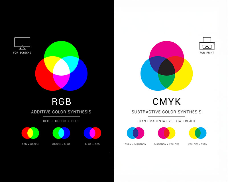
  1. RGB (Red, Green, Blue):
    • Used for: Digital displays such as computer screens, smartphones, and websites.
    • How it works: RGB is an additive color model, meaning colors are created by combining different intensities of red, green, and blue light. The more light you add, the closer you get to white.
    • Why it’s different: RGB is designed for light-based media, meaning that colors will often appear brighter and more vibrant on screens than they will in print.
  2. CMYK (Cyan, Magenta, Yellow, Black):
    • Used for: Printing on paper and other physical media.
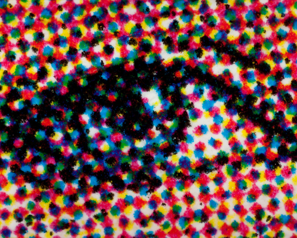
    • How it works: CMYK is a subtractive color model, meaning colors are created by subtracting light using different levels of ink. When combined, cyan, magenta, and yellow produce a wide range of colors, while black (K) is added to deepen shadows and improve contrast.
    • Why it’s different: Unlike RGB, CMYK colors may appear less vibrant due to the limitations of physical ink, but they are specifically designed for print reproduction.

For high-quality printing, it’s essential to convert your RGB designs to CMYK to ensure color accuracy. This color conversion is especially important when preparing images, graphics, and illustrations for printing. What looks perfect on a digital screen may look slightly different once printed, which is why prepress checks and color profiling are critical steps in maintaining color elegance.

Achieving Color Elegance: Tips for Effective Color Use

Achieving color elegance in print isn’t just about picking the right colors; it’s about using them thoughtfully and harmoniously. Here are some key tips for achieving color elegance in your print designs:

1. Limit Your Color Palette

While it may be tempting to use as many colors as possible, less is often more. A limited color palette creates a more refined, cohesive look that’s easier on the eyes. Stick to three to five primary colors and choose accent colors that complement your main hues. This helps create a more elegant, balanced design without overwhelming your audience.

2. Use Contrast Wisely

Contrast is one of the most effective ways to make certain elements of your design stand out. But contrast isn’t just about using light versus dark shades; it’s about playing with color opposites on the color wheel (complementary colors), such as:

  • Red and green
  • Blue and orange
  • Yellow and purple Contrast can add depth and dimension to your design, but be careful not to overdo it. Too much contrast can make a design feel chaotic or cluttered, which detracts from the elegance you’re trying to achieve.

3. Consider Color Harmony

In color theory, harmony refers to how well colors work together. There are different types of color harmonies you can use in your print design:

  • Analogous Colors: Colors that sit next to each other on the color wheel (e.g., blue, green, and yellow). These create a calm, harmonious feel.
  • Complementary Colors: Colors that are opposite each other on the color wheel (e.g., red and green). These create high contrast but can be vibrant and energetic when used effectively.
  • Triadic Colors: Three colors that are evenly spaced around the color wheel (e.g., red, yellow, and blue). This creates a balanced, vibrant design.

By using color harmonies, you can create a sense of flow in your design that makes it feel more polished and sophisticated.

4. Leverage Color for Brand Recognition

Your brand’s color scheme is a powerful tool for recognition. Brands like Coca-Cola, Apple, and McDonald’s have achieved iconic status in part because of their distinctive color choices. When designing print materials for your brand, ensure that your colors are consistent across all touch points—from your logo to your marketing collateral. This reinforces your identity and helps your audience recognize your brand at a glance.

5. Test Colors Before Going to Print

As we discussed earlier, colors can look different on screens versus on paper. Monitor calibration and color profiling are essential steps in achieving the desired outcome. It’s always a good idea to request a print proof from your printer before committing to a large run. This allows you to see how the colors translate from digital to print and make adjustments if necessary.

Printing Insights - Color Elegance - Phillips Printing Company

The Role of Paper and Finishing in Color Elegance

While color is a critical aspect of design, the type of paper you print on can also affect how colors appear in the final product. Glossy, matte, and uncoated papers all interact with ink differently. Glossy papers, for example, tend to enhance color vibrancy and are often used for high-end marketing materials like brochures and catalogs. On the other hand, matte paper provides a more subdued, elegant finish and is ideal for non-profits organizations, luxury branding and sophisticated designs.

Additionally, finishing techniques like spot UV coatings, embossing, or foil stamping can add depth and texture to your print project, enhancing the overall elegance and appeal.

Final Thoughts: The Power of Color Elegance in Print

In the world of print, color elegance is not about being bold for the sake of it; it’s about creating a design that speaks to the viewer in a way that feels harmonious, refined, and purposeful. The careful selection and use of color can elevate your brand, communicate your message clearly, and ensure that your print materials stand out in a crowded market.

By understanding the psychology of color, selecting the right formats and models for print, and using color harmonies effectively, you can unlock the true potential of color in your print design. Whether you’re creating marketing materials, packaging, or business collateral, color elegance can transform your project from ordinary to extraordinary.

When it comes to printing, remember that color matters—and a well-executed color strategy can make all the difference in delivering a memorable and impactful message.

Recycling Results: How to Maximize Your Marketing Impact

In today’s fast-paced marketing world, businesses are always looking for ways to get the most out of their campaigns—both in terms of budget and long-term impact. One often-overlooked yet powerful way to maximize your marketing efforts is through recycling results. No, we’re not talking about the literal recycling of materials but rather the idea of repurposing and reusing content, insights, and strategies from previous campaigns to enhance future ones.

In this blog post, we’ll explore how recycling results can transform your marketing strategy, help you optimize your resources, and boost your campaign performance. Let’s dive into how you can take past campaigns and recycle their value to create even more successful marketing efforts moving forward.

Why Recycling Results is Essential for Modern Campaigns

In a world of rapidly changing trends and consumer behavior, it might seem tempting to always start fresh with every new campaign. However, recycling results from previous efforts offers a way to leverage valuable insights and content that you’ve already developed. This approach allows you to work smarter—not harder—and build on the foundation of what’s already working for your business.

Here are some key reasons why recycling results is crucial:

  1. Cost Efficiency: Creating marketing content from scratch can be expensive and time-consuming. By repurposing elements of past campaigns, such as ad copy, design elements, and audience insights, you can reduce both the cost and effort required for new campaigns.
  2. Improved Performance: Recycling past content allows you to test and iterate on what’s been successful. You can refine your messaging, optimize your visuals, and fine-tune your targeting to increase engagement and conversions.
  3. Consistency: By building upon successful past campaigns, you ensure your messaging remains consistent across all channels. This helps reinforce your brand identity and creates a cohesive experience for your audience.
  4. Increased Reach: Campaigns can only reach so many people in their original form. Repurposing that content for different formats—social media posts, email newsletters, blog posts, or videos—extends the reach of your efforts to new audiences.

How to Recycle Campaign Results Effectively

Now that you understand the value of recycling campaign results, let’s look at practical strategies for incorporating this approach into your marketing efforts.

1. Repurpose Content for Different Platforms

One of the easiest ways to recycle your results is by repurposing content across various platforms. A well-performing blog post can become an engaging email, a series of social media posts, or even a podcast episode or video. Here’s how you can extend the life of your content:

  • Social Media Posts: Take excerpts from blog posts, infographics, or whitepapers and turn them into attention-grabbing social media posts. Create carousel posts, short video clips, or quote images to share on platforms like Instagram, LinkedIn, and Twitter.
  • Email Newsletters: If a particular topic or piece of content generated interest in your last campaign, include it in your next email newsletter with updated information or a fresh perspective. Don’t forget to A/B test subject lines for better engagement.
  • Videos and Webinars: Turn a successful blog post into a video or webinar. This is especially effective for educational content, as video can help reinforce key points and offer more interaction with your audience.

By adapting content for different channels, you can reach new audiences while maintaining the integrity of your original messaging.

Campaign Strategies - Recycling Results - Phillips Printing Company

2. Leverage Audience Insights and Data

Another way to recycle results is by analyzing the data from previous campaigns. Metrics such as open rates, click-through rates, conversion rates, and social media engagement can provide valuable insights into what’s working and what needs improvement.

Here’s how you can use these insights to refine your strategy:

  • Segment Your Audience: Analyze the data to understand which segments of your audience engaged the most with past campaigns. Use this information to create targeted, more personalized marketing efforts in the future.
  • A/B Testing: Take your best-performing subject lines, call-to-action buttons, or imagery, and test them again in your next campaign. Even small tweaks can significantly improve your performance.
  • Identify Trends: Look for recurring patterns in your campaign results—whether it’s a specific time of day that drives more conversions or certain words in your copy that resonate with your audience. Use these trends to fine-tune your next campaign for even better results.

By data mining your past campaigns, you can pinpoint the strategies that work best for your audience and scale them up for future campaigns.

3. Update Old Content with Fresh Perspectives

Recycling doesn’t always mean reusing content verbatim. Sometimes, a little refreshing is all it takes to breathe new life into a campaign. Here are some ways to update old content to make it more relevant:

  • Rewriting Blog Posts: Review high-performing blog posts that are still getting traffic but might be a little outdated. Update the information, add new statistics, and include current examples to ensure that your content is still timely and valuable.
  • Refresh Visuals: Take your top-performing graphics, infographics, or brochures, and update them with new images, colors, or design elements that reflect current trends or seasonal changes. This ensures your content doesn’t look stale while keeping the original messaging intact.
  • Seasonal Campaigns: Revisit past holiday promotions or themed campaigns. Update them with new offers, but keep the same format or creative ideas that worked in the past. This is an effective way to create recurring campaigns with minimal effort.

Updating content allows you to reuse valuable assets while keeping your messaging current and engaging.

Recycling results isn’t limited to content repurposing or data analysis; it’s also about promoting previous campaigns in new ways. For example, if you’ve run a successful email campaign, you can promote it on your website or through your social media channels. Here’s how to cross-promote effectively:

  • Feature Past Successes: Highlight past campaign successes, such as customer testimonials or case studies, in your future marketing efforts. For instance, a blog post from a past campaign could be promoted as a “highlight” on your homepage or linked to your next newsletter.
  • Create Series or Follow-Ups: If a specific topic or product garnered great interest in your last campaign, consider running a follow-up campaign that builds on the momentum. Offer a deeper dive into the topic or introduce an updated version of the product.

Cross-promotion helps you reconnect with past audiences while keeping your messaging fresh and relevant.

Tracking Your Recycling ROI

While recycling results can save you time and money, it’s essential to track the return on investment (ROI) of these recycled efforts to ensure they’re working. Make sure to use metrics like:

  • Engagement Rates: Are people still responding to recycled content? Are you seeing a similar level of interaction as in the original campaign?
  • Conversion Rates: Are recycled campaigns converting as well as their original counterparts? If not, consider revisiting the creative or tweaking your messaging.
  • Customer Feedback: Pay attention to comments or feedback from your audience. They might provide insights into whether they appreciate the updated content or if they prefer something new.

By regularly tracking the effectiveness of your recycled campaigns, you can fine-tune your approach and improve the ROI of every campaign.

Final Thoughts: Embrace the Power of Recycling Results

Recycling results isn’t about being lazy or taking shortcuts—it’s about maximizing the value of the hard work you’ve already put into your marketing campaigns. By repurposing content, leveraging data, updating old assets, and cross-promoting related campaigns, you can ensure that your marketing efforts continue to work for you long after the initial launch.

So, the next time you’re brainstorming ideas for your next campaign, take a step back and ask yourself: What can I recycle? You might be surprised by how much value you can unlock by breathing new life into your past successes.

With a thoughtful, strategic approach, recycling results can lead to stronger, more cost-effective campaigns that deliver ongoing value for your business.

The Postage Elephant

Navigating the Costs and Benefits of Direct Mail Campaigns

When it comes to direct mail campaigns, the cost of postage often becomes a significant consideration for marketers. It’s easy to overlook, but understanding postage rates and how they impact your budget can make or break the success of a campaign. In fact, for many businesses, postage is the “elephant in the room”—a necessary cost that’s often underestimated or not fully understood.

In this blog post, we’ll explore how postage affects your direct mail strategy, offer insights into how to reduce mailing costs, and show you how to make postage work for you to maximize your campaign’s effectiveness.

The Cost of Postage: Why It’s a Big Deal

In a world where digital marketing often steals the spotlight, direct mail remains a reliable, tangible marketing tool that delivers results. Whether you’re sending out postcards, brochures, catalogs, or newsletters, direct mail allows you to engage your audience in a physical, personal way. However, one of the biggest barriers for many businesses is the cost of postage.

The USPS (United States Postal Service) has a complex system of postage rates based on several factors:

  • Size and weight of the mailpiece
  • Mailing class (First Class, Standard, Nonprofit, etc.)
  • Delivery speed (e.g., expedited services or regular mail)
  • Discounts available for bulk mailing or presorted mail

Because postage rates are scaled by weight, size, and class, they can vary greatly, and businesses often find themselves dealing with higher-than-expected shipping costs. When managing a direct mail campaign, understanding these factors—and how to optimize them—is key to maintaining an efficient budget.

Understanding Postage Classes: Finding the Right Fit

The USPS offers several postage classes for different types of direct mail, and selecting the right class is crucial to managing your postage costs. Here’s a breakdown of the main mail classes available:

  1. First-Class Mail:
    • Best for: Time-sensitive materials, such as invoices, promotional letters, or invitations.
    • Features: First-Class Mail is the fastest and most reliable option, offering delivery within 1-3 days. It includes tracking and forwarding services, making it a great choice for important communications.
    • Postage Costs: Typically the most expensive class, but can be worth the investment for high-priority mail.
  2. Standard Mail (Marketing Mail):
    • Best for: General marketing materials like postcards, catalogs, and flyers.
    • Features: This class offers slower delivery times (typically 2-8 days) but is more affordable than First-Class Mail. Standard Mail can be presorted to receive discounts, which further lowers costs.
    • Postage Costs: Much cheaper than First-Class, making it ideal for larger campaigns where speed isn’t a critical factor.
  3. Nonprofit Mail:
    • Best for: Nonprofit organizations looking to send fundraising materials, newsletters, or membership renewals.
    • Features: Nonprofits can take advantage of heavily discounted rates for eligible mailings. However, there are specific requirements for eligibility, and only certified nonprofit organizations can use this rate.
    • Postage Costs: Significant savings compared to other classes.
  4. Periodicals:
    • Best for: Magazines, journals, and publications.
    • Features: If you’re distributing a periodical publication, this class is ideal. It comes with discounted rates, but the mailpiece must meet certain standards.
    • Postage Costs: Generally cheaper than First-Class, but only available for periodical publications with specific frequency and content.
  5. Priority Mail and Priority Mail Express:
    • Best for: Larger items that require fast delivery.
    • Features: These services offer faster delivery speeds (1-3 days for Priority Mail) with added benefits like tracking and insurance. Priority Mail Express guarantees overnight delivery.
    • Postage Costs: More expensive than First-Class, but ideal for high-value or urgent mailpieces.
Direct Mail Insights - The Postage Elephant - Phillips Printing Company

The Hidden Costs of Postage: Size and Weight Matter

When it comes to direct mail, size and weight are not just afterthoughts—they can significantly affect your postage costs. The USPS determines the cost of mail based on its dimensions (length, width, and height) and its weight. This means that oversized mail or mail with additional weight (due to extra inserts or thicker paper stock) will cost more to send.

For example:

  • A 5” x 7” postcard will cost much less to mail than a 10” x 13” brochure, even if both pieces are for the same campaign.
  • Heavier catalogs or packets will have a higher postage rate because they weigh more, which requires more resources to transport.

To manage postage costs effectively, consider the following:

  • Choose the right size for your mailpiece. Oversized items may seem more eye-catching, but they come with a higher price tag. Often, a slightly smaller piece will suffice.
  • Be mindful of weight. Thin paper stock, lightweight inserts, and minimal folding can help keep your direct mail under weight thresholds that lead to price hikes.

Presorted Mail: Unlocking Bulk Discounts

One way to significantly reduce postage costs is by using presorted mail. Presorted mail refers to mail that has been sorted by ZIP code or other criteria before it’s handed off to the USPS. This sorting process ensures that mail is delivered more efficiently, and the USPS rewards businesses with a discount for sorting and preparing the mail in advance.

By presorting your mail into the right categories, you can take advantage of these bulk mailing discounts to save on postage. However, presorting mail often requires a higher volume of mail, typically in the hundreds or thousands of pieces.

Reduce Postage Costs with Intelligent Mailing Lists

An often-overlooked element of reducing postage costs is optimizing your mailing list. Targeting the right audience and avoiding wasted deliveries can help you get the most out of your direct mail budget.

Tips for mailing list optimization:

  • Remove duplicates from your list. Sending multiple mailpieces to the same address is a waste of resources.
  • Verify addresses to reduce undeliverable mail and avoid additional charges.
  • Use address standardization tools to ensure that your list is USPS-compliant and avoid higher postage rates for incorrectly formatted addresses.
Direct Mail Insights - The Postage Elephant - Phillips Printing Company

The Benefits of Understanding Postage

While postage may seem like a daunting cost, having a strong grasp of the available postage classes, size and weight restrictions, and bulk mailing discounts can go a long way in making your direct mail campaign more cost-effective. By carefully planning your mailpieces and working with a knowledgeable printer or direct mail service provider, you can reduce postage expenses while ensuring your message reaches your audience.

Here are some additional benefits of understanding the postage landscape:

  • Budget Optimization: Knowing which mail classes and formats best suit your goals helps you avoid overspending on postage.
  • Better ROI: With lower postage costs, you have more budget to spend on design, printing, and other elements that can improve the effectiveness of your direct mail campaign.
  • Faster Campaign Execution: By planning your postage strategy upfront, you avoid delays and confusion in the mailing process.

Final Thoughts: Making Postage Work for You

Postage may seem like an elephant in the room when it comes to direct mail, but understanding how to navigate the world of mailing costs can be a game-changer for your business. With the right knowledge and strategies, you can optimize postage rates, create more targeted mailings, and achieve a higher return on investment (ROI) from your direct mail campaigns.

Whether you’re sending a small batch or launching a large-scale campaign, taking the time to understand postage costs and using that knowledge to your advantage will make all the difference. The “postage elephant” doesn’t have to be a barrier—it can become a key player in your overall direct mail success.

The Many Faces Of Images

Understanding Image Formats, Resolution, and Quality for Successful Printing

In the world of print design, images are more than just a visual element—they are the heart and soul of your marketing materials, brochures, business cards, posters, and much more. Whether you’re creating a stunning visual for a campaign or simply working on a flyer, the quality of your images plays a critical role in the success of your print project. But before these images make their way to the press, they go through an essential process known as prepress.

Prepress is a crucial phase that prepares your digital designs for printing, ensuring that the images you’ve selected are optimized and ready for the best possible output. In this blog post, we’ll explore the many faces of images in the prepress world, including the various image formats, how to choose the right resolution, and the importance of image quality for a seamless print production process.

The Importance of Prepress in Image Quality

Before an image reaches the printing press, it must undergo specific steps to ensure it looks as vibrant and professional as intended. Prepress is the process that helps prepare the artwork—images included—by checking for errors and optimizing it for the press. A well-executed prepress process can make the difference between a crisp, clean image and one that’s blurry, pixelated, or color-imbalanced.

Understanding the many faces of images in prepress means understanding the intricacies of how digital files are prepared and what kind of images will deliver the best results when printed.

Image Formats: Choosing the Right One for the Job

When working with images for print, it’s crucial to select the appropriate file format. The file format determines how your image is stored, its quality, and how it behaves when used in design programs. The most common image formats in prepress are JPEG, PNG, TIFF, and EPS, each with its own advantages and considerations.

Here’s a breakdown of the most common formats:

  1. JPEG (Joint Photographic Experts Group):
    • Best for: Photographs and images with gradients.
    • Pros: JPEG files are smaller in size, making them ideal for web use or quick sharing.
    • Cons: JPEG uses lossy compression, meaning some quality is sacrificed for file size. This can lead to blurring or pixelation when used in large-scale printing projects.
  2. PNG (Portable Network Graphics):
    • Best for: Images with transparent backgrounds or logos.
    • Pros: PNG supports lossless compression, so image quality isn’t compromised. It also handles transparencywell, making it ideal for logos or designs that need to sit on top of colored backgrounds.
    • Cons: Larger file sizes compared to JPEGs.
  3. TIFF (Tagged Image File Format):
    • Best for: High-quality images for professional print materials.
    • Pros: TIFF files use lossless compression, meaning they retain every detail and are often preferred in professional printing. TIFF images are large and detailed, providing excellent quality when enlarged.
    • Cons: These files can be quite large and may require more storage space.
  4. EPS (Encapsulated PostScript):
    • Best for: Vector graphics (like logos and illustrations).
    • Pros: EPS files are scalable without loss of quality, meaning they can be resized to any size without becoming pixelated. This makes them ideal for logos, icons, and vector artwork.
    • Cons: EPS files can be tricky for beginners and might not be suitable for complex images like photos.

By understanding the characteristics of each format, you can choose the right one based on your specific print project’s needs.

The Role of Resolution in Image Quality

Resolution refers to the detail an image holds and is typically measured in DPI (dots per inch) or PPI (pixels per inch). When it comes to print, resolution is critical because it directly impacts how sharp and clear an image will appear once printed.

In general:

  • 300 DPI is the standard resolution for most print materials. At this resolution, images appear sharp, clean, and detailed, even when enlarged.
  • 72 DPI is standard for web images, but it is too low for print. Low-resolution images (below 300 DPI) often appear blurry or pixelated when printed.

Why 300 DPI is Ideal for Printing

When preparing images for print, 300 DPI ensures that your image will be crisp and clear when reproduced on physical materials like brochures, posters, or catalogs. The higher the DPI, the more pixels the image contains, leading to better detail and sharpness.

When using images for large-format prints like posters or banners, you can often use lower resolutions because the print will be viewed from a greater distance. However, for most print projects—especially those viewed up close, such as business cards or flyers—300 DPI is the gold standard for optimal quality.

Prepress Desk – The Many Faces of Images - Phillips Printing Company

The Many Faces of Image Quality

In the prepress world, image quality isn’t just about resolution and format—it’s about ensuring every image is optimized for its intended purpose. Here’s what you need to consider:

  1. Color Accuracy: Colors on your screen often look different when printed due to the variations between digital (RGB) and print (CMYK) color models. In prepress, color conversion from RGB to CMYK is essential to ensure your images print as expected.
  2. Image Cropping and Composition: Sometimes, an image needs to be cropped or adjusted to fit the layout of your project. In prepress, these adjustments must be made carefully, ensuring the final composition looks professional and balanced.
  3. Sharpening and Smoothing: Images sometimes require adjustments for sharpness, especially if they’re being enlarged. Prepress professionals will ensure that images are sharpened without introducing undesirable artifacts, like noise or pixelation.
  4. Image Editing and Retouching: In some cases, images need to be retouched or edited to remove blemishes, adjust lighting, or improve contrast. This step ensures that every visual element is print-ready and looks its best.

Image Compression: Balancing Quality and File Size

When working with images, compression is a key factor to consider. Compression reduces the file size of images for easier storage and faster loading times, but it can also impact quality.

  • Lossy Compression (used by formats like JPEG) sacrifices some image quality to achieve a smaller file size. While this is fine for web use, it’s not recommended for high-quality prints.
  • Lossless Compression (used by formats like PNG and TIFF) retains every bit of image data, ensuring that the quality remains intact while reducing file size.

In prepress, the balance between quality and file size is crucial. Large files can slow down the printing process or be difficult to handle, but reducing file size too much can result in a loss of detail. It’s important to optimize images for printing without over-compressing.

Prepress Desk – The Many Faces of Images - Phillips Printing Company

Conclusion: Preparing Images for the Press

The prepress stage is vital for turning your digital artwork into print-ready files. By understanding the many faces of images—formats, resolution, color accuracy, and quality—you can ensure that your images are optimized for the highest-quality print production.

When preparing your images, always:

  • Choose the right file format based on your project.
  • Ensure images are at the correct 300 DPI resolution for print.
  • Adjust colors from RGB to CMYK to ensure accurate print reproduction.
  • Optimize images for quality without sacrificing file size.

By mastering these essential prepress elements, you can confidently create print materials that showcase your images in their best light. After all, the visuals you choose are the face of your brand, and with the right preparation, they can make a lasting impression on your audience.

The Impact of Extended Gamut

In the world of printing, color accuracy is paramount. Whether you’re designing a brand logo, a marketing brochure, or a packaging concept, color is often the first thing your audience notices. Extended Gamut is a game-changer in color reproduction, offering a wider and more precise color range than ever before. If you’re aiming to push the boundaries of print quality, embracing Extended Gamut can be the key to achieving the bold, vibrant hues your designs deserve.

What Is Extended Gamut, and Why Does It Matter?

Traditional printing processes use a limited set of color inks—Cyan, Magenta, Yellow, and Black (CMYK)—to reproduce a wide range of hues. However, there are many colors outside this traditional gamut that can’t be accurately reproduced. This is where Extended Gamut comes in. Extended Gamut printing adds additional colors. Orange, Green, and Violet add to the standard CMYK palette, expanding the color space and allowing for more precise, vivid results.

Think of it like a painter adding more colors to their palette. Having access to more pigments means being able to recreate a wider variety of shades and tones. Extended Gamut unlocks the potential for richer colors, improved gradients, and more detailed imagery in your printed materials.

The Advantages of Extended Gamut in Print

  1. Improved Color Accuracy and Consistency
    With Extended Gamut, printers can achieve colors that are more faithful to the original design. This is particularly useful for brands that require exact color matching. This occurs across multiple print runs or applications. The added colors ensure a higher degree of consistency across different media, whether you’re printing on paper, packaging, or fabric.
  2. Wider Color Range for Richer Designs
    Incorporating additional color channels significantly expands the color spectrum. Designers can now achieve more vibrant oranges, greens, and purples—colors that were previously challenging to reproduce with the standard CMYK process. This broader color palette allows for more nuanced and visually striking designs that capture attention and convey brand identity more effectively.
  3. Better Gradients and Color Transitions
    Extended Gamut printing excels in gradient accuracy, making it ideal for designs that require smooth transitions between colors. With more inks at your disposal, you can produce intricate gradients and color blends that flow seamlessly, giving your printed materials a sophisticated, high-quality look.
  4. Reduction in the Need for Spot Colors
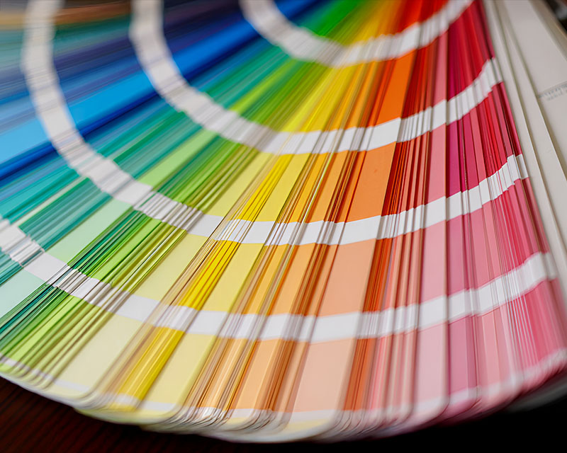
    One of the standout benefits of Extended Gamut is the ability to reduce the need for spot colors. Spot colors (like Pantone) are often used for precise brand color reproduction, but they can add cost and complexity to the printing process. Extended Gamut enables printers to reproduce these colors using the standard ink set, streamlining the production process and reducing costs.
  5. Sustainability Benefits
    Using fewer inks for specific color needs can contribute to sustainability. By reducing the number of spot inks and minimizing waste during the printing process, Extended Gamut helps companies meet their environmental goals. Fewer ink changes also translate into a more efficient and eco-friendly production cycle.

How Extended Gamut Elevates Your Designs

Extended Gamut’s expanded color range isn’t just for precision. It also enhances the overall aesthetic of your designs. With its ability to replicate more colors, Extended Gamut opens up exciting creative possibilities. Imagine a luxury packaging design with deep, rich hues that demand attention. Or a marketing campaign that leverages vibrant shades to engage and excite an audience.

For industries such as cosmetics, fashion, and food packaging, where color accuracy can make or break a product’s appeal, Extended Gamut can create the perfect visual impact. The consistency and vibrancy offered by this technology set a high standard for print quality.

The Impact of Extended Gamut - Printing Insights - Phillips Printing Company

Applying Extended Gamut to Your Print Projects

Integrating Extended Gamut into your print project is relatively straightforward, but it does require the right equipment and expertise. Not all printers are equipped for this process, so working with a printer that offers Extended Gamut capabilities is essential.

Here’s how it works: When preparing your design, you’ll need to ensure that your file is optimized for Extended Gamut printing. This involves specifying the colors you want to use in your design and ensuring that your file is in the correct color space. The prepress team will then adjust your artwork to match the extended gamut, ensuring that all colors are correctly mapped and balanced for the print process.

From there, the printing process utilizes the expanded color set to produce a finished product with enhanced color accuracy and depth. Whether you’re creating brochures, catalogs, or high-end packaging, Extended Gamut will give your designs the clarity and vibrancy they deserve.

Unlocking the Full Potential of Your Brand’s Visual Identity

In an increasingly visual world, your brand’s color identity is more important than ever. With Extended Gamut printing, you can push the boundaries of what’s possible in color reproduction. This technology allows you to create designs that stand out and leave a lasting impression on your audience. From the subtle nuances of gradients to the bold vibrancy of a brand’s signature hues, Extended Gamut ensures your prints remain true to your vision.

Conclusion: Why Embrace Extended Gamut?

If you’re ready to take your print materials to the next level, consider adopting Extended Gamut printing. With its expanded color space and ability to reproduce complex color schemes with unparalleled precision, this technology offers endless possibilities for creating striking, high-quality printed pieces. Whether you’re aiming for consistency across multiple prints, enhancing your brand’s color identity, or simply elevating the overall aesthetic of your designs, Extended Gamut is a powerful tool that can give your prints the wow factor they deserve.

Extended Gamut isn’t just a trend—it’s the future of printing, bringing color accuracy and creativity to new heights.