Contact Us
Get Quote
Upload File
888-ask-phil

Author: Marc Allen

The Payoff for Nonprofits

It helps to use the right tool for the job, and there can often be multiple options on the table. The most effective and efficient tool to use may be clear-cut in some situations, but not so much in others.

Sometimes the number of options considered depends on the environment, the task and the desired results. For instance, if you wanted thinly sliced tomato for a sandwich, a sharp knife would certainly be your best choice. However, if the desired result were a mashed tomato for sauce, then a hammer would work, although it would be a bit messier. In this case, the tomato is the environment, breaking down the tomato is the task, and for it to be in slices or mashed are the desired results. The knife would also work to break down the tomato for sauce, and would likely be most peoples’ choice in both situations. Though, this demonstrates which tool is truly best for the task of breaking down the tomato is more clearly defined based the desired results.

Whether it’s in the kitchen, in life, or in business, we are all after the same goal…to be successful. Being successful may mean different things to different people and in different contexts, but achieving that goal often involves tools, resources and strategies.

These days there are many options to choose from when it comes to marketing channels–TV, radio, direct mail, billboards, web ads, email, social media, etc. And, there can be several options within each one of those categories. Social media marketing can involve Facebook, Instagram, Twitter, and Google posts as well as web videos and website content. Which of these to use, again depends on our environment, task, and desired results.

Most businesses operate within a common environment. This environment usually involves the same tools, resources, and strategies. The tools are the various marketing channels. The resources refer to a business’ ability to deploy those tools and the size of the market itself. The strategy is the planned process of applying these resources to certain tools. All of this effort comes down to performing a task (marketing or fundraising) to achieve desired results (sales or donations) in a given environment (B2C, B2B, or nonprofit organization).

Most nonprofits have one thing in common…profit. They need to bring in money or resources enough to at least cover whatever it is they provide as an organization minus expenses–with the addition that all excess profit goes toward the cause. In the standard B2C or B2B model this is achieved by selling a product or service to the consumer or other business. In a nonprofit model this is achieved by selling the promise of the service or product that the organization provides for others. One of the aspects that make the transaction for nonprofit organizations different from for-profit businesses is that there is often no product exchanged for the donation. Since the primary function of fundraising is typically just for the organization to receive monies, the ability to accommodate this transaction becomes an important factor in choosing a marketing channel.

The marketing channel that accommodates this for many nonprofits is direct mail. Direct mail has several benefits that no other marketing channel can match. Direct mail is tangible. It has the ability to connect through a sense of touch. The physical element of paper, textures, and the basic experience of holding something and reading text by reflected light versus reading off a glowing screen all contribute to a feeling of honesty–a feeling of something real, of something that can be trusted. Direct mail has proven itself as the most trusted form of marketing time and time again. Quickly establishing trust with a potential donor is very important. The donor needs all the reassurance possible that the organization does what they say and that the donor’s money will be used wisely.

Direct mail also offers a lot of real estate. An organization can mail out a newsletter or booklet with in-depth stories and information about their cause for a fraction of the cost of TV. And, unlike TV, radio or the web, the audience can be qualified on an incredibly detailed level. This means the organization can get their message directly in the hands of someone that has shown interest in their cause and/or may meet the appropriate demographics.

Besides the physical effectiveness, real estate, and targetable aspects, direct mail offers a mechanism to send money to the organization. Nonprofit direct mail appeals usually include a reply card that a donor can fill out with their information and payment method. A courtesy reply envelope (postage paid by sender/donor) or a business reply envelope (postage paid by receiver/nonprofit org.) is also typically included in the outgoing mailing. This mechanism provides a level of convenience for the recipient. An online method of donating can also be included so the recipient has a secondary call-to-action in case they don’t have checks or stamps readily available. For this reason, a BRE (business reply envelope) is recommended. Though the postage is higher and at the expense of the nonprofit, the convenience for the donor and the additional contributions usually outweigh the cost.

According to a 2017 report from the Data & Marketing Association (thedma.org), direct mail can have a median ROI of 29%, much higher than paid search ads.1 Nonprofits shouldn’t ignore the other marketing channels though. When direct mail is used in conjunction with email marketing or digital ads, response rates can increase up to 118%.2

Direct mail can be a highly effective marketing tool for any business and is particularly well suited for nonprofits due to its ability to establish trust and give the recipient multiple ways to respond. To get the most out of your marketing dollar, and hopefully receive the most dollars for your cause, consider a marketing campaign that includes direct mail as a companion to your digital efforts.

1-nonprofitpro.com, 2-nonprofitsource.com

The Mystery of Spot Colors

If the word Pantone® conjures up thoughts of complex color theory, expensive swatch books, or a mysterious color system of which you’ve heard of, perhaps even used, but wouldn’t want to give a lecture on, don’t worry…you’re not alone. The truth is, understanding colors in the Pantone Matching System® (PMS) is relatively simple when you learn how they are created and how they are used.

Pantone began in the 1950’s as a printing company in New York. In the mid-60’s they began standardizing ink colors and creating reference books which ultimately became the Pantone Matching System; a system that designers and manufacturers can use as a reference to reproduce specific colors. The system has become an industry standard and primarily consists of printed swatch books for process and solid colors with a given ink formulization and L*a*b* target. L*a*b* is the widest visual color gamut and is used as the target due to common ink pigment and production variances. Though the Pantone library contains CMYK formulation references (process colors), most people reference the solid colors library (spot colors). Within these libraries, Pantone produces ink references on coated papers (C) and uncoated papers (U). The same ink will have a different L*a*b* value when it is printed on coated paper versus uncoated paper. They also produced a reference on matte paper for a short time, but has since been discontinued (guard your matte book well if you have one). X-Rite Inc. purchased Pantone in 2007.

In printing, colors are typically reproduced using one of two methods. First, and primarily, colors are reproduced using CMYK process (cyan, magenta, yellow, black). These four colors are combined to create all colors we see in graphics and images. For instance, cyan and yellow will make green, magenta and yellow will make red, etc. A similar process is used in your television or computer, which reproduces colors using RGB process (red, green, blue). However, RGB color reproduction relies on an emissive process where when more color is added the result gets closer to white. When more color is added in CMYK color reproduction, which relies on a reflective process, the result gets closer to black. An emissive process generates light whereas a reflective process requires an environmental light source. The second method for reproducing colors in print is with Pantone spot colors. The Pantone system currently uses a set of 14 base colors plus transparent white to reproduce all of the spot colors in the PMS library. These base colors include Reflex Blue, Process Blue, Blue 072, Violet, Purple, Rhodamine Red, Rubine Red, Red 032, Warm Red, Orange 021, Yellow, Yellow 012, Green, and Black. By using more base colors with a wider range of pigments the Pantone system can yield colors that are not achievable with CMYK process. A few colors in particular, like some oranges, blues, and greens, can be well outside the CMYK color gamut.

If Pantone spot colors have such a wider color gamut, you may wonder why we don’t use them all of the time. The reason has to do with practical production. A printing press is typically set up with CMYK process colors all of the time. Most jobs will be reproduced with CMYK in order to simply achieve most colors and CMYK is necessary to reproduce full color images anyway. Adding a spot color to the job involves making or purchasing the spot color ink, producing an additional printing plate, and setting up and washing up of another printing unit. All of this involves time and money. Additionally, if that Pantone color can be achieved with CMYK, meaning it is inside the CMYK color gamut, then it usually makes no sense to spend the time and money to run a spot color.

There are times, however, when it makes sense to run a spot color. If there is heavy usage of a brand color throughout a piece like a book or large brochure it may make sense to run that as a spot color for consistency purposes. Since CMYK colors are produced using four independent printing units they rely on the consistency of each unit to maintain the same color build throughout the production run. A spot color is a premixed ink in a single printing unit, relying only on that one unit for consistency. Spot colors also tend to look more smooth or solid than process colors because they are single premixed inks, whereas process colors are made from dot patterns of each of the CMYK colors. Instances where a piece uses a color outside the CMYK color gamut it can sometimes be necessary to run as a spot color in order to not compromise the design. In all cases, the number of spot colors used in addition to CMYK is typically limited to one or two. Designing a piece with process images and six spot colors is not practical to produce given the cost and limitation of the number of printing units on most lithographic presses.

When designing pieces for print it is okay to use spot colors even if the piece will ultimately be produced with CMYK; just make sure that spot colors are converted to process in the file so that your preview of the colors accurately represents what will be produced. In InDesign® spot colors can be set to process individually by double-clicking the color in the swatch pallet and setting the color type to process, or globally in the ink manager by checking “all spots to process.” Also be sure to use the appropriate solid spot color library, C or U, depending on whether the piece will be printed on coated or uncoated paper. This will help set expectations of what can be achieved in production. Pantone also produces “bridge” books that show spot colors and their equivalent process color side by side in both coated and uncoated formats–a must-have for any print designer.

If you have any questions regarding spot colors or designing for print, please feel free to contact us or call Phillips prepress at 888-ask-phil.

The Math of Folding Panels

I know what you’re thinking­–math, no, anything but math! But, don’t worry; it’s not that bad. Truth is, math is used in everyday situations more often than people realize. From figuring out your monthly budget to counting your cups of coffee, it’s everywhere, and it doesn’t compromise.

Today, we’re not doing anything too complicated. I’m going to discuss a few basic principles of folding panels for printed pieces. Why do we need math to figure folding panels? It’s a matter of physics. When folding a sheet of paper we must take into account the thickness of the paper itself, the air or gap between the folded sheets, the bunching up of the paper where it folds, and the folding mechanism. Some papers and folds may require different panel measurements than others, but for most products there is a single measurement we can apply to figure each panel, and that is 1/16 inch, or 0.0625”. This can be adjusted to 0.06”, 0.065”, or 0.07” if desired, but for purposes of using an American standard ruler we will use 0.0625”.

When a sheet of paper is folded into a basic trifold format there are two different panel measurements. The two outside panels (the front panel and back panel when folded) are the same width. The inside panel (the one that folds in first) must be slightly shorter so that it does not bunch up against the opposite fold.

In this example of a 9” x 12” trifold brochure (Figure 1), the outside panels are exactly 4” with inside panel being 0.0625” shorter, allowing the piece to fold to 4” and making the actual flat trim size 9” x 11.9375”.

Another way to fold this piece is to fold it to something slightly larger than 4” so that we retain the flat trim size of 9” x 12” (Figure 2). In this example the outside panels fold to 4.023” with the inside panel being 3.954”. This may seem like a simpler solution, however, it can be problematic if the artwork does not take into account the folding aspects and is designed with even panels. It is often simpler for production to trim the inside panel short rather than adjust or stretch the outside panel graphics in prepress to accommodate the fold.

There are times when one or the other of these solutions is preferred. Typically, for a standard 8.5” x 11” trifold we will keep the flat trim size at 8.5” x 11” making the finished folded size 3.6875” and adjust the artwork accordingly. For an 8.5” x 25.5” trifold we will usually trim the inside panel short so the piece folds down to 8.5” x 11”. For brochures with more panels that fold in formats like roll fold, double-parallel, gate-fold, or even iron cross, the general rule is that each panel be consecutively 0.0625” shorter than the next. A double-parallel fold would have the two outside panels the same width and the two inside panels the same shorter width. A gate-fold piece would have the two center panels the same width and the two outer panels the same shorter width.

In all cases the finished size will be determined by the artwork and the ability to adjust, if needed, in prepress. Adequate bleed and proper panel sizes allow the bindery to obtain proper folds and produce a quality finished product. Contact Phillips prepress if you have any questions regarding designing for print. We’re here to help.

Hybrid vs. Stochastic Screening

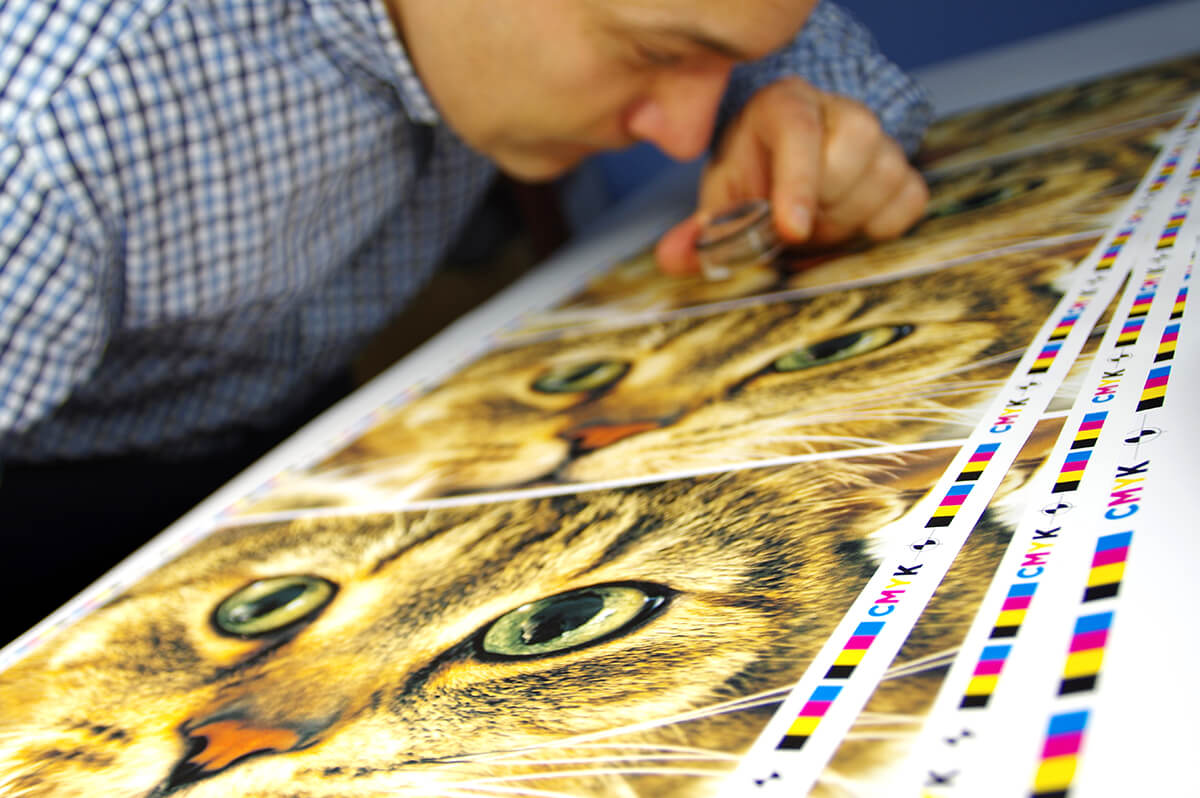
As the old saying goes, there is more than one way to screen a cat…the image of a cat that is–a little printing humor there. All lame puns and disturbing metaphors aside, I am referring to the different types of screening in lithographic printing. Within any manufacturing process there can often be multiple production method options with pros and cons in each. In addition to a general explanation of the process, I will discuss the benefits and challenges of two of the standard screening methods used in offset lithographic printing.

What is a screen?

In printing, a screen can refer to a tint of a single color and/or a resolution of sorts. A lighter tint of black would produce gray, and how smooth that gray is could be considered the resolution, or line screen (lines per inch)–which I’ll discuss later. The type of screening refers to the tint, particularly, how the tint is produced. Imagine a screen door material that has holes in it to allow air to pass through. Now imagine putting that material on top of a piece of paper and pressing ink through the screen. The size of the holes and the number of holes would determine how much ink gets to the paper. Less holes or smaller holes would allow less ink, yielding a lighter tint, whereas more holes or larger holes would allow more ink, yielding a darker tint. This is basically how screen-printing works. Screen-printing involves using an emulsion process to block out areas of a fine mesh to control the ink applied to a substrate. The ink is applied directly through the mesh to the substrate. Each color has its own screen and is applied one at a time. It is primarily used for simplistic designs in textile printing and high-volume signage.

The process in lithographic printing is similar, except the “screen” that determines the tint is imaged onto a metal plate which transfers the ink to a rubber blanket which then transfers it to paper. This process is also called offset printing. Most printers use CMYK process to produce full-color images. With CMYK process all colors are reproduced through the combination of four base colors–cyan, magenta, yellow, and black. Each of these colors is printed in various tints and combinations to produce all the colors we see in images and graphics. How the tint is produced for each color is referred to as the screening method.

Screen types

There are two types of screening methods used in lithographic printing. The first, and most common, is amplitude-modulated screening (AM screening). This method uses a fixed dot pattern. As the tint gets darker the size of each dot is increased, as the tint gets lighter the size of each dot is decreased, but the number of dots in a given area stays the same.

AM screening is commonly used among printers due to its controllable nature. Most printing plates and blankets available on the market today can easily support a standard AM screen and there is less sensitivity in how well the ink is carried and transferred to the paper. Although, the quality and balance of consumables and proper calibration will always greatly affect the level of quality and consistency that can be achieved.

Because AM screening uses a fixed dot pattern, each of the four CMYK process colors must be at different angles so that the dots do not line up on top of each other. The four colors are typically at (Y) 0˚, (C) 15˚, (K) 45˚, and (M) 75˚. However, this combination of the same pattern at different angles creates a rosette pattern and is one of the well-known drawbacks of AM screening (figure 5). If you look at any full-color printed piece with a magnifying glass or loop you will likely be able to see this pattern of interlocking circles.

The second type is frequency-modulated screening (FM screening). FM screening is also referred to as stochastic screening. This method uses a very small fixed dot size. As the tint gets darker the number of dots is increased, as the tint gets lighter the number of dots is decreased, but the size of the dots stays the same.

FM screening has many advantages when reproducing fine images. Because FM screening utilizes a small random dot pattern, the level of detail and smoothness that can be achieved is far greater than with AM screening. FM screening does particularly well in reproducing high-resolution images of fabric, leather, skin tones or any image where there are very fine details in the textures. Another drawback with AM screening is the potential to produce a moiré effect. Though, a moiré is most often seen when reproducing a scan of a printed piece resulting in a multiplication of the rosette pattern, it can also occur when reproducing an image with a fine geometric pattern like fabric. This is because the rosette pattern of the screen can interact with the pattern of the fabric. This is not an issue with FM screening because there is no consistent pattern to the dots. FM screening also tends to use less ink because there is more dot gain (as there are generally more dots) – meaning less ink is required to produce the same visual tint.

Line Screen

AM screening also involves a line screen. A line screen is the number of halftones per inch, expressed as lines per inch (LPI). This determines how fine the dot pattern is, or how close together the dots are. The closer together the dots are the higher the resolution that can be achieved. However, with higher resolution and finer dots come more challenges in maintaining a consistent result or a smooth image. Most sheetfed lithographic printers will run a 133 to 175 line screen. This is high enough to produce a very smooth image and still be somewhat forgiving. There is also a type of screening that utilizes both methods called hybrid screening. Hybrid screening is primarily AM screening, but at tint values below 5% and above 95% it uses FM screening. This allows for smoother transitions and imaging in highlights and shadows.

FM screening does not use a line screen because the size of the dot is fixed and the pattern is considered random. The equivalent aspect for FM screening would be the size of the dot, which is measured in microns. Most printers running stochastic will use a 20 to 30 micron dot size. Not all printing plates can handle maintaining a clean dot that size. Even if the platesetter (CtP) can image the dot, the plate surface must be able to maintain the dot during printing. If the dot erodes during printing the image will start to disappear or become lighter. This erosion of the plate image is called blinding. The fountain solution, which is the water/chemical solution that keeps the plate clean where there should not be ink (the water versus oil principle), can also play a part in whether blinding occurs.

You may be wondering why, if FM screening looks so much better and uses less ink, more printers don’t use it. In addition to some of the potential challenges mentioned above, there is usually an additional license purchase and it does take a lot of effort in creating and maintaining proper calibration as well as discovering the right balance of consumables to yield a consistently good result. However, with diligent color management, equipment maintenance, and the right consumables, stochastic screening can be a huge benefit to the printer and produce a much higher quality product for the client.

Phillips utilizes both hybrid and stochastic screening methods and is G7 color-space certified in both. If you would like to see examples of printed pieces using these different methods or have any questions, feel free to contact us or call us at 888-ask-phil.

Proof to Print

One of the biggest challenges with producing any custom product is setting the customer’s expectation before production begins. This is true in many industries and it is no less of a challenge in printing. The reason for this is that the equipment that produces a single printed proof typically uses a different printing method and material than the press that will produce the piece in high volumes.

A contract proofer typically uses an inkjet printing method whereas high-volume commercial presses use lithographic (offset) or flexographic printing methods. There are also toner-based digital printers that can be used for both proofing and production. Inkjet printers spray ink onto specialized stocks compatible with inkjet technology. Lithographic and flexographic presses use a series of rollers to transfer ink to paper. Inkjet proofers typically use 6 to 11 colors to produce full-color images. A lithographic press usually uses only 4 colors–cyan, magenta, yellow, and black–to produce full-color images. These different methods of production naturally result in differences in color, finish, and capability. The type of paper also plays a roll in the color that will be produced. A gloss sheet will have vibrant, high-contrasting color, and an uncoated sheet will have lighter, more muted colors. The challenge is both targeting each piece of equipment to a given standard (or to each other) and hitting that target with consistency.

We accomplish this by first fine-tuning the prepress and press operations including PDF workflow, CtP calibration, plate linearization, ink consistency, press consumables, press mechanics, and press operation consistency. If the process and elements involved in producing color is constantly changing then it does no good to hit a given target when the starting point could be different from day today. Much like leveling a house on an unstable foundation. Once this process is stable with an established baseline we use a combination of dot gain curves and ICC profiles to adjust the color. Color charts with thousands of patches are scanned and analyzed to create ICC profiles. This process usually takes several rounds to get the printed result off press to a G7 colorspace standard. A similar process is then applied to the proofer and digital presses. There are two ways to go at matching the proofer to the press. One could use the output of the press as the target for the proofer. This would tend to be more accurate within a company for a given press but could result in the proofer having a higher Delta E than it could achieve for the standard target. It would also isolate that company’s color to its press as opposed to meeting a global standard. Another way is to use the same G7 standard as the target for the proofer. As long as the press is able to achieve a low Delta E for the same target then this would allow the press and proofer to rely on each other as a common reference with the proofer having the lowest Delta E possible for the standard target. There are different standards for coated and uncoated papers and coincidentally separate processes to achieve and/or simulate the color standard on each.

There are different proofing stocks for inkjet printers for simulating coated versus uncoated products. Coated stocks will have a glossy surface and uncoated (typically called matte for inkjet media) will have a rougher non-glossy surface. One element that limits an ICC’s ability to simulate color between the proof and press is the base white point of the proofing stock. This is measured in whiteness, which is a paper’s ability to reflect all colors equally under D65 lighting conditions, and brightness, which is the amount of blue light the stock reflects. Brightness is also affected by the amount of optical brightening additives in the paper, which can make the paper appear bluer. It is important that the white point of the proofing stock be as close as possible to the white point of the offset stock. This establishes a comparable base between the two media and allows the proofer to more closely simulate the full-color gamut of the press.

Phillips Printing uses an 11-color inkjet proofer to produce contract proofs that very closely simulate the color we can achieve with our offset presses on both coated and uncoated stocks. Our offset press, proofer, and digital presses all meet Idealliance colorspace standards. Setting our clients expectations at the proofing stage has proven to be a valuable asset by greatly limiting any surprises with the finished product. It also allows us to fine tune graphics with accuracy to make sure our clients get what they want. To learn more about proof-to-print and G7 grayscale/colorspace certifications visit idealliance.com or contact us.

Getting Back to Basics

Keeping things simple is usually the best strategy when planning or building anything. Whether you’re developing a marketing campaign, designing a car, or traveling into space – the fewer factors there are to contend with the more stable and effective the operation will be.

If one were planning an operation into space, let’s say to drop a rover on Mars, the more complicated the rover functions are or deployment operation is, the more likely it is for the mission to fail. For as many things that must go right for an operation to be successful, there is an equal amount of opportunity for things to go wrong.

For the same reasons, if one were to design a car, the more bells and whistles there are, the more opportunity there is for one of them to have a problem. Granted, both of these operations are complicated and there are plenty of successful space missions and highly intelligent computers on four wheels driving around. But, the principle still holds true in relation to success rates. The more seams there are on a roof, the more opportunity there is for leaks; the more people there are in a quality-check process, the more likely one of them is having a bad day; the more components there are in the assembly of a product, the more likely one of the components will fail.

When applying this same principle to marketing we can relate the complexity of the message to the number of things that the recipient must figure out. Consider a direct mail piece for a home improvement business that has several pages worth of information. On the front of the piece a headline reads “Your number one source for all of your home improvement and home repair needs.” On the inside of the piece each page lists the company’s various services from flooring to painting to appliance repair to roofs to masonry, and so on. Although a piece like this would indeed present the company’s services to the recipient, it also presents a lot of information for them to sift through and decipher. This would likely overload the reader with so much information that they are likely to miss information that is relevant to them, or possibly take in none of it. In addition, a person that may be in the market for a new roof is not very likely to also be in the market for a new floor.

A more effective approach for this type of business would be to split up the marketing of different services into multiple direct mail pieces. A direct mail piece that is just focused on roof repair would have a much better chance of success, and not just in response rate but closure. By not forcing the recipient to pick out the part of the message that is relevant to them we are doing some of the work for them. This increases the chance that the full message is read because there is less information to sift through. By focusing on a single service the company would also be able to target a more specific demographic. This increases the chance that the message will be relevant to the recipient. Simply put, a single piece with a simple message has a much better chance of being read, being relevant, and being retained by the recipient. The company can then apply that approach to each service they offer. With each piece they have the opportunity to highlight a service with a more focused message and target a more relevant market.

Although the cost of a multi-piece campaign would certainly be more than a single all-in-one marketing approach, the justification for the increased marketing expense should be based on the campaign’s effectiveness. This effectiveness is typically measured as ROI (return on investment). As any marketer knows though, ROI is often not easily calculated when it comes to how much each marketing channel is contributing to the bottom line. What made a customer ultimately decide to place an order is usually not very clear or even the result of any one thing. It can often be due to multiple touches, be that direct mail, web advertising, phone calls, emails, or a mixture.

A marketer often must trust in the basics, where presenting a clear message in front of the right person is the best one can hope for. There are basic rules and practices that can help achieve this goal. The first is a clear message. A message that clearly and quickly describes your product or service is key. As discussed above, do not hide your message among other services or offers that force the customer to read between the lines. The message should also be presented from the viewpoint of how the product or service helps the customer. Do not preach how experienced your company is or how your product is the best. Instead, try to focus on presenting how that expertise or superior product can make your customer’s life better. What does it do for them? What are your customer’s fears and challenges and how will your company help solve them. A customer must be able to see how your product or service will help them achieve their goal. This is what will make the connection between the customer’s need and your message, and hopefully result in success for all.

The second basic principle is repetition. Repetition helps maximize retention. People usually need to be presented with a message several times before they remember it. This is just the nature of the human brain. It often takes multiple touches for the mind to take note of what’s important. Another reason for low retention could be the timing of the message. A customer may not be in the market for a new roof this year, but could be considering it next year. It is best to maintain constant presence in your customer’s mind, so when they’re ready to buy you’re their first call. In relation, one reason it is often difficult to calculate ROI is partly due to multiple marketing channels, and with repetition within each marketing channel the calculation is compounded.

Lastly, your message can be clear and presented multiple times, but if it is going to the wrong person none of that matters. Data is one of the most important factors in determining the success of any marketing effort. You can advertise roof replacement service to someone living in an apartment all day long, but the chance of a sale there is pretty close to zero. There is a huge selection of filters available when purchasing data for a mailing list. Data can be filtered by location, homeowner and family demographics, financial information, property information, and much more. Existing customer information can also be used to analyze what a relevant customer may look like. By using existing data and information available with purchased data one can very specifically target a market that is most likely to contain potential customers.

If you are questioning your marketing efforts don’t worry, you are not alone. Many marketers struggle with trying to educate prospects about their products or services and wonder if they are being understood. Just remember, keeping it simple is usually best. Trust in the basics of marketing repeatedly with a clear message to the most relevant prospects you can attain.

Business is Personal

Imagine you’re in the middle of mowing your lawn when all of a sudden a big knock and cloud of smoke exits your lawn mower. There you are, holding on to a now giant paperweight watching the ghost of your mower slowly drift down the road. This is not good. For one, your lawn mower has apparently just died. Second, you now have an uneven lawn that resembles alien crop circles. You need to borrow your neighbor’s mower. Here are two different approaches you could take to getting your neighbor to happily loan you their mower:

“Hi, neighbor, my lawn mower broke, can I borrow yours?”

Or, “Hi, Bob, my lawn mower broke, can I borrow yours?”

There is only one difference between these two sentences. One is generic and one is personal. It is much more likely that your neighbor will feel better about loaning you his mower when there is sense of personal connection. Addressing your neighbor by their name conveys that you know them. When we feel like someone knows us we are more likely to trust him or her. We are more likely to expect they will treat us like a friend as opposed to some random person. And, a friend will more likely treat your assets (a lawn mower) as they do their own because there is an implied ongoing relationship. Although, the fact that your own lawn mower just blew up would probably give your neighbor a little concern over their own.

This psychological affect that personalization has on the brain can be seen in all types of situations in life. It can also be a highly effective tool in marketing, particularly with direct mail. Personalization is utilized in many forms of media from emails to web pages (PURLs) to personalized ads and entertainment based on browsing history to the way your phone interacts with you. The small detail of personalization is a way to make all of these interactions feel more relevant and trustworthy. Direct mail is the one form of media, however, where we have the opportunity to not only address the person by name, but we can do it through an already trusted marketing channel that is tangible and memorable.

Personalization in direct mail has shown to increase the response rate in some cases by 135%.1 This form of personalized marketing is particularly effective with nonprofits, which can bring in 60 to 80% of their total revenue through direct mail fund raising efforts.2

Personalization doesn’t need to stop at just addressing a person by name. Anything that is in your database can be used to personalize a direct mail piece such as previous buying or giving history, location, age, race, gender, ages of children, age of home, income, etc. There are endless possibilities when it comes to what variables can be used and how. Variables in the data can be used as simple text, or can trigger different messages entirely from the whole letter body to the graphics and images. In fact, when more complex variable data is used to construct messages in direct mail the response rates can increase up to 500%.1

Marketers must be cautious though. One element that can turn an otherwise great personalized message into a complete failure is bad data. Addressing your neighbor Bob as Mrs. Burnett will greatly hinder the likelihood of you finishing your lawn. Effective personalized marketing relies on high quality data. It is vitally important that if you use personalization in any of your marketing efforts that you have accurate data. It is well worth it to utilize CASS and NCOA services, implement strict data entry practices with staff, and periodically review your database to maintain accuracy. Do not expect a mail service provider to catch oddities in your data. Including records marked as “do not mail” or having notes such as “deceased” in the name fields can often make it into the mail. Data for mailing is typically processed with software that only looks at the street address and compares records based on an alphanumeric string.

Creating a great personalized direct mail campaign doesn’t have to be difficult. With good design, high quality data, and accurate production, one can easily pull off a highly effective marketing effort. Phillips Printing provides consultation, design, data services, production and mailing for such campaigns. Please contact us if you have any questions regarding the process. We’re here to help.

1 Canon Solutions America. 2 Pursuant.

Hybrid vs. Stochastic Screening

As the old saying goes, there is more than one way to screen a cat…the image of a cat that is–a little printing humor there. All lame puns and disturbing metaphors aside, I am referring to the different types of screening in lithographic printing. Within any manufacturing process there can often be multiple production method options with pros and cons in each. In addition to a general explanation of the process, I will discuss the benefits and challenges of two of the standard screening methods used in offset lithographic printing.

What is a screen?

In printing, a screen can refer to a tint of a single color and/or a resolution of sorts. A lighter tint of black would produce gray, and how smooth that gray is could be considered the resolution, or line screen (lines per inch)–which I’ll discuss later. The type of screening refers to the tint, particularly, how the tint is produced. Imagine a screen door material that has holes in it to allow air to pass through. Now imagine putting that material on top of a piece of paper and pressing ink through the screen. The size of the holes and the number of holes would determine how much ink gets to the paper. Less holes or smaller holes would allow less ink, yielding a lighter tint, whereas more holes or larger holes would allow more ink, yielding a darker tint. This is basically how screen-printing works. Screen-printing involves using an emulsion process to block out areas of a fine mesh to control the ink applied to a substrate. The ink is applied directly through the mesh to the substrate. Each color has its own screen and is applied one at a time. It is primarily used for simplistic designs in textile printing and high-volume signage.

The process in lithographic printing is similar, except the “screen” that determines the tint is imaged onto a metal plate which transfers the ink to a rubber blanket which then transfers it to paper. This process is also called offset printing. Most printers use CMYK process to produce full-color images. With CMYK process all colors are reproduced through the combination of four base colors–cyan, magenta, yellow, and black. Each of these colors is printed in various tints and combinations to produce all the colors we see in images and graphics. How the tint is produced for each color is referred to as the screening method.

Screen types

There are two types of screening methods used in lithographic printing. The first, and most common, is amplitude-modulated screening (AM screening). This method uses a fixed dot pattern. As the tint gets darker the size of each dot is increased, as the tint gets lighter the size of each dot is decreased, but the number of dots in a given area stays the same.

Printing 2_Figure 1
Printing 2_Figure 3

AM screening is commonly used among printers due to its controllable nature. Most printing plates and blankets available on the market today can easily support a standard AM screen and there is less sensitivity in how well the ink is carried and transferred to the paper. Although, the quality and balance of consumables and proper calibration will always greatly affect the level of quality and consistency that can be achieved.

Printing 2_Figure 5

Because AM screening uses a fixed dot pattern, each of the four CMYK process colors must be at different angles so that the dots do not line up on top of each other. The four colors are typically at (Y) 0˚, (C) 15˚, (K) 45˚, and (M) 75˚. However, this combination of the same pattern at different angles creates a rosette pattern and is one of the well-known drawbacks of AM screening (figure 5). If you look at any full-color printed piece with a magnifying glass or loop you will likely be able to see this pattern of interlocking circles.

The second type is frequency-modulated screening (FM screening). FM screening is also referred to as stochastic screening. This method uses a very small fixed dot size. As the tint gets darker the number of dots is increased, as the tint gets lighter the number of dots is decreased, but the size of the dots stays the same.

Printing 2_Figure 2
Printing 2_Figure 4

FM screening has many advantages when reproducing fine images. Because FM screening utilizes a small random dot pattern, the level of detail and smoothness that can be achieved is far greater than with AM screening. FM screening does particularly well in reproducing high-resolution images of fabric, leather, skin tones or any image where there are very fine details in the textures. Another drawback with AM screening is the potential to produce a moiré effect. Though, a moiré is most often seen when reproducing a scan of a printed piece resulting in a multiplication of the rosette pattern, it can also occur when reproducing an image with a fine geometric pattern like fabric. This is because the rosette pattern of the screen can interact with the pattern of the fabric. This is not an issue with FM screening because there is no consistent pattern to the dots. FM screening also tends to use less ink because there is more dot gain (as there are generally more dots) – meaning less ink is required to produce the same visual tint.

Printing 2_Figure 6

Line Screen

AM screening also involves a line screen. A line screen is the number of halftones per inch, expressed as lines per inch (LPI). This determines how fine the dot pattern is, or how close together the dots are. The closer together the dots are the higher the resolution that can be achieved. However, with higher resolution and finer dots come more challenges in maintaining a consistent result or a smooth image. Most sheetfed lithographic printers will run a 133 to 175 line screen. This is high enough to produce a very smooth image and still be somewhat forgiving. There is also a type of screening that utilizes both methods called hybrid screening. Hybrid screening is primarily AM screening, but at tint values below 5% and above 95% it uses FM screening. This allows for smoother transitions and imaging in highlights and shadows.

FM screening does not use a line screen because the size of the dot is fixed and the pattern is considered random. The equivalent aspect for FM screening would be the size of the dot, which is measured in microns. Most printers running stochastic will use a 20 to 30 micron dot size. Not all printing plates can handle maintaining a clean dot that size. Even if the platesetter (CtP) can image the dot, the plate surface must be able to maintain the dot during printing. If the dot erodes during printing the image will start to disappear or become lighter. This erosion of the plate image is called blinding. The fountain solution, which is the water/chemical solution that keeps the plate clean where there should not be ink (the water versus oil principle), can also play a part in whether blinding occurs.

You may be wondering why, if FM screening looks so much better and uses less ink, more printers don’t use it. In addition to some of the potential challenges mentioned above, there is usually an additional license purchase and it does take a lot of effort in creating and maintaining proper calibration as well as discovering the right balance of consumables to yield a consistently good result. However, with diligent color management, equipment maintenance, and the right consumables, stochastic screening can be a huge benefit to the printer and produce a much higher quality product for the client.

Phillips utilizes both hybrid and stochastic screening methods and is G7 color-space certified in both. If you would like to see examples of printed pieces using these different methods or have any questions, feel free to contact us or call us at 888-ask-phil.

Proof to Print

One of the biggest challenges with producing any custom product is setting the customer’s expectation before production begins. This is true in many industries and it is no less of a challenge in printing. The reason for this is that the equipment that produces a single printed proof typically uses a different printing method and material than the press that will produce the piece in high volumes.

A contract proofer typically uses an inkjet printing method whereas high-volume commercial presses use lithographic (offset) or flexographic printing methods. There are also toner-based digital printers that can be used for both proofing and production. Inkjet printers spray ink onto specialized stocks compatible with inkjet technology. Lithographic and flexographic presses use a series of rollers to transfer ink to paper. Inkjet proofers typically use 6 to 11 colors to produce full-color images. A lithographic press usually uses only 4 colors–cyan, magenta, yellow, and black–to produce full-color images. These different methods of production naturally result in differences in color, finish, and capability. The type of paper also plays a roll in the color that will be produced. A gloss sheet will have vibrant, high-contrasting color, and an uncoated sheet will have lighter, more muted colors. The challenge is both targeting each piece of equipment to a given standard (or to each other) and hitting that target with consistency.

We accomplish this by first fine-tuning the prepress and press operations including PDF workflow, CtP calibration, plate linearization, ink consistency, press consumables, press mechanics, and press operation consistency. If the process and elements involved in producing color is constantly changing then it does no good to hit a given target when the starting point could be different from day to day. Much like leveling a house on an unstable foundation. Once this process is stable with an established baseline we use a combination of dot gain curves and ICC profiles to adjust the color. Color charts with thousands of patches are scanned and analyzed to create ICC profiles. This process usually takes several rounds to get the printed result off press to a G7 colorspace standard. A similar process is then applied to the proofer and digital presses. There are two ways to go at matching the proofer to the press. One could use the output of the press as the target for the proofer. This would tend to be more accurate within a company for a given press, but could result in the proofer having a higher Delta E than it could achieve for the standard target. It would also isolate that company’s color to its press as opposed to meeting a global standard. Another way is to use the same G7 standard as the target for the proofer. As long as the press is able to achieve a low Delta E for the same target then this would allow the press and proofer to rely on each other as a common reference with the proofer having the lowest Delta E possible for the standard target. There are different standards for coated and uncoated papers and coincidentally separate processes to achieve and/or simulate the color standard on each.

There are different proofing stocks for inkjet printers for simulating coated versus uncoated products. Coated stocks will have a glossy surface and uncoated (typically called matte for inkjet media) will have a rougher non-glossy surface. One element that limits an ICC’s ability to simulate color between the proof and press is the base white point of the proofing stock. This is measured in whiteness, which is a paper’s ability to reflect all colors equally under D65 lighting conditions, and brightness, which is the amount of blue light the stock reflects. Brightness is also affected by the amount of optical brightening additives in the paper, which can make the paper appear bluer. It is important that the white point of the proofing stock be as close as possible to the white point of the offset stock. This establishes a comparable base between the two media and allows the proofer to more closely simulate the full color gamut of the press.

Printing 1_Figure 1

Phillips Printing uses an 11-color inkjet proofer to produce contract proofs that very closely simulate the color we can achieve with our offset presses on both coated and uncoated stocks. Our offset press, proofer, and digital presses all meet an Idealliance colorspace standards. Setting our clients expectations at the proofing stage has proven to be a valuable asset by greatly limiting any surprises with the finished product. It also allows us to fine tune graphics with accuracy to make sure our clients get what they want. To learn more about proof-to-print and G7 grayscale/colorspace certifications visit idealliance.com or contact us.